For Members
Community
A guide for every tool, plus trading education and resources. Public, so you can see exactly what's inside before you join.
TradingView
TradingView Indicators
A big thank you to Miles from the community for his help refining these tools. When you see (Miles) next to an indicator on TradingView, it has had his fine eye on the programming and logic.
Discord
Trading Tools Trader & Quant
Discord
Market Intel Quant only
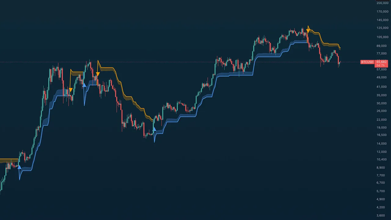
TA Confluence Bands
Overview
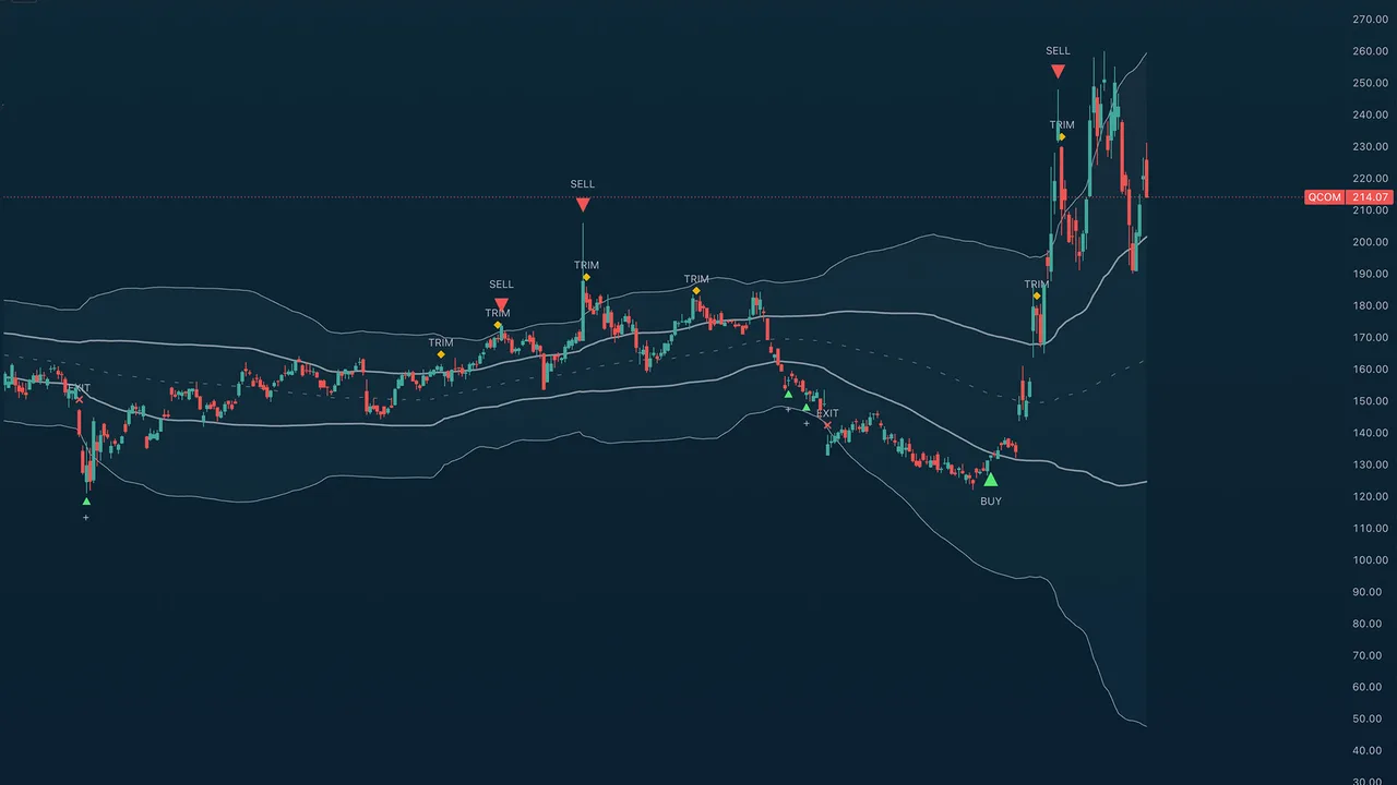
TA (Miles) Confluence Bands wraps price in an asymmetric two-pair band structure and runs a weighted multi-factor confluence engine on top to time accumulation, profit-taking, and exits. It is built for mean-reversion and swing work: scale into stretched declines, scale out of stretched rallies, and stand aside when the evidence is mixed. A single shared midpoint carries two independent deviation pairs whose overlap defines three zones — a buy shoulder below, a middle span, and a sell shoulder above.
Quick Start
Add the indicator to a 4H or daily chart. Read the zones first: the buy shoulder (lower cloud) is where accumulation clusters, the sell shoulder (upper cloud) is where trims and the take-profit fire. Use the ADD markers to scale into a decline, the BUY as confirmation of a turn, and TRIM and SELL to scale out of a rally. Raise Signal Suppression on fast or noisy symbols.
Settings Reference
Signal Sensitivity
- Buy Sensitivity and Sell Sensitivity — each Conservative, Neutral, or Aggressive. A mode is not a single threshold; it retunes a coordinated set of factors at once (tier spacing, the confluence floor, the turn detector, how soon a cycle re-arms, and minimum bar spacing).
- Signal Suppression (bars) — a global cooldown so no signal of any type fires within this many bars of the previous one.
- Show forming SELL marker — when on, a dim SELL triangle can appear while the live bar is still forming and solidifies on close (or disappears if the setup fails). Forming markers only ever show on the live bar — they never repaint a closed candle.
- Show forming aggressive BUY marker — the same idea for the Aggressive dip BUY (Aggressive buy mode only).
- Suppress SELL during parabolic runs — in a steep blow-off the first rejection wick rarely marks the top, so the SELL is held back while price still rides a steeply climbing fast MA and fires once that MA cracks — landing on the real top instead of selling into strength.
- Detect rounded / rolling tops — also flag SELLs at distribution tops that roll over slowly (fast-EMA rollover, a run of lower highs, or a close back below the 21-EMA with fading momentum) rather than only sharp-wick tops.
Band Calculation
- Source — the price the bands are built from: Open, High, Low, Close, or a composite (HL2 Median, HLC3 Typical, OHLC4 Average, HLCC4 Weighted Close).
- MA Length — default 100; the midpoint moving-average period.
- MA Type — SMA or EMA for the midpoint.
- Band deviations — the four deviation multipliers (two pairs) so you can fit the geometry to any asset; the buy side can be set deeper than the sell side.
Band Display
- Show Midpoint MA and Show Zone Fills — master toggles.
- Per-cloud colors — independent color and transparency for the Sell Shoulder (upper), Middle Span, and Buy Shoulder (lower), so you can set the lower cloud green and the upper cloud red, fade any of them, or hide the middle on its own.
- Fill Middle Span — shade the central span between the inner bands, not just the shoulders.
Visualization
- Show Entry / Exit Markers — master switch for all signal markers.
- Show BUY / SELL signals on markers — turn off to keep the markers (triangles / diamonds / crosses) but hide the BUY / SELL / ADD / TRIM / EXIT text, for a cleaner chart.
- Show Score Dashboard — off by default; a table summarizing the net score, regime (Squeeze / Trend Up / Trend Down / Range), the reversal and trend bucket readings, grouped factor contributions, the current signal, and the live accumulation and distribution tiers.
The Signals
- ADD (small plus) — tier-by-tier accumulation as price stretches below the mean during a decline.
- BUY — a confirmed reversal of a sufficiently deep decline. In Aggressive buy mode, a real-time dip finder also prints BUY markers at support when a genuine discount or oversold reading turns up (it resolves on the live or just-closed bar and never repaints).
- TRIM — scaled partial de-risk, one per new higher tier as a rally extends.
- SELL — a weighted reversal-exhaustion take-profit off a confirmed swing high at the sell shoulder. Sparse by design; it fires on significant tops only.
- EXIT — a protective stop when price breaks the deepest lower band with weak momentum.
Usage Tips
Read the zones first and let the markers scale you in and out. Set Buy and Sell Sensitivity to fit the asset and your style, and raise Signal Suppression on fast or noisy symbols. The dashboard is the best way to see why a signal did or did not fire — turn it on while you learn the tool, then hide it.
Alerts
Signal alerts for Accumulate Add, Prime Bottom (buy), Pivot Buy, Trim, Sell, and Protective Exit, plus regime/structure alerts for Squeeze Start, Squeeze Release, and the bullish/bearish upper and lower band crosses.
TA Mean Reversion
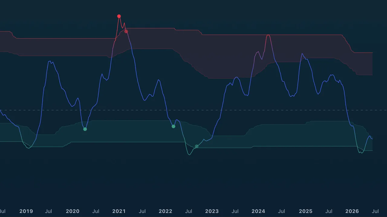
Overview
TA (Miles) Mean Reversion measures how far price has stretched from its mean, in standard deviations, and walks each reversal through four stages so you can watch a turn build before it triggers. The core line is a z-score (price versus its moving average, normalized by volatility) blended with RSI for momentum exhaustion, then smoothed. Overbought and oversold zones frame the extremes, and a staged pipeline marks where a reversal is worth acting on. An optional lower-timeframe engine can also mark when a faster timeframe reverses, for multi-timeframe context.
Quick Start
Add the indicator to a 4H or daily chart, pick the Trading Style preset that matches your holding period, and leave the rest at defaults. Watch the line color-shift toward red as it stretches overbought and green as it stretches oversold, and act on the circle (TRIGGER) markers. Raise Noise Suppression on faster or noisier symbols for fewer, cleaner signals.
Settings Reference
Mean Reversion Settings
- Trading Style — one preset scales the whole tool from Very Aggressive (scalp) to Very Conservative (position), setting the mean and deviation lookback from 20 to 100 bars.
- Line Smoothing — preset (None, Low, Mid, High, Very High); smooths the oscillator for a cleaner signal. Default High.
Noise Suppression
- Noise Suppression — a single 0–100 master dial that scales the dominance window, the signal cooldown, and a minimum turn-magnitude filter together. 0 fires every qualifying turn; higher gives fewer, cleaner ones. Default 30.
Adaptive Zones
- Adaptive zones (percentile) — on by default. The overbought and oversold levels track rolling percentiles of the oscillator itself, so the zones auto-tune to how far each asset and timeframe actually stretches. Turn off for fixed levels.
Manual Zone Levels (used only when Adaptive zones is off)
Set the fixed bands yourself, in standard deviations of the line. Widen them for volatile assets so signals fire only on bigger stretches; tighten them for calmer assets so the bands still get reached.
- Overbought outer / inner band (+σ) — the sell extreme and approach.
- Oversold inner / outer band (−σ) — the buy approach and extreme.
These four levels appear in the settings at all times but only take effect when Adaptive zones is off (TradingView cannot hide an input conditionally).
Reversal Confluence
- Stretch threshold — Asymmetric (default; buys arm at the inner oversold band, sells require the outer overbought band), Inner band (both at ±1σ), or Outer band (both at ±2σ).
- Turn detector — how turn evidence is gathered: Pivot + rollover (default), Any, MR pivot only, or MR rollover only.
Regime Filter (off by default)
- Enable regime filter — require volatility contraction before a trigger.
- Block counter-trend triggers — no sells in an uptrend, no buys in a downtrend.
- Require ATR contraction — part of the regime gate.
Display
- Show TRIGGER markers, Trigger display filter (All qualifying or only strong), Show SETUP markers, Show zone-exit confirmations, Show zone fills, State background highlight (off, setup, or strict watch), Show readout table, and Table position.
Multi-Timeframe Markers (off by default)
- Enable lower-TF reversal markers — turns on a parallel engine that runs the full reversal pipeline on a faster timeframe and prints a small + on the line when it fires. In an uptrend a green + flags a lower-timeframe oversold dip (a potential add); in a downtrend a red + flags a lower-timeframe overbought bounce (a potential trim).
- Lower timeframe — Auto (about two steps down from your chart) or set it manually.
- Context filter — how the chart's own zone gates the marks: Continuation only (default, and the cleanest — buys only while the chart is overbought, sells only while oversold), Mute redundant, or Off.
- Context band buffer — widens the zones the context filter uses; raise it for more marks. Intentionally conservative at 0.5 by default.
- LTF display filter and LTF cooldown — tighten or loosen the faster engine independently of the chart-timeframe signals.
Colors
A gradient line option plus neutral, bullish (oversold), and bearish (overbought) colors.
Usage Tips
Read the pipeline, not a single threshold: WATCH (approach with fading momentum), SETUP (price and volume agreement at the extreme), TRIGGER (the actionable circle), and CONFIRM (clean exit back through the outer band). The asymmetric default stretch suits names that grind up and drop fast. Treat the lower-timeframe markers as a multi-timeframe nudge — a green + in an uptrend is a spot to consider adding, a red + in a downtrend a spot to consider trimming — then confirm on the faster chart. Remember the manual band levels only matter when Adaptive zones is off.
Alerts
A full set: zone entries (OB/OS approach), extremes (overbought/oversold outer), OB/OS watch and setup states, buy and sell triggers, strong buy and sell triggers, confirmed buy/sell reversals, and lower-timeframe buy/sell reversals.
TA Stack Attack
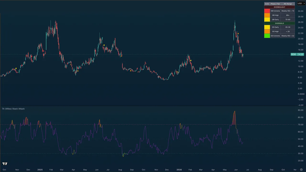
Overview
TA (Miles) Stack Attack is a multi-timeframe RSI confluence engine. It reads RSI across a ladder of timeframes at once — a 1H / 4H / Daily / Weekly swing stack by default — and fires a three-phase signal sequence when those timeframes stack into agreement: the moments when an asset is overbought or oversold almost everywhere at once, not just on your chart.
Quick Start
Add the indicator to any 1H-or-higher chart. The standard RSI plots in the pane and the phase arrows print on the price chart. Watch for the Phase 2 and Phase 3 triangles (on by default) as your reversal cues, and use the color reference table to learn what each marker means. The tool runs on the 1-hour chart and above on every TradingView plan; if you have TradingView Premium, enable sub-hour scanning to run it on the 1-minute chart.
Settings Reference
RSI
- RSI Length — default 14, the Wilder standard.
- Min timeframes required for stack signal — default 2; how many of the 1H / 4H / Daily reads must agree before a stack counts.
- Enable sub-hour scanning (TradingView Premium) — off by default. The sub-hour stack leans on 15-second and 30-second data, which only TradingView Premium plans provide. Leave it off on lower plans and the tool pauses gracefully below 1H instead of throwing a data error. Turn it on with Premium to trade the 1-minute chart.
- Composite weighting — how the composite RSI weights the stack. Higher timeframes (default) weights the slow end most (Weekly heaviest in standard mode, the 5m in sub-hour). Blended weights all four rungs equally. Lower timeframes weights the fast end most. Current chart leans the composite onto the chart's own RSI with a light multi-timeframe taper, so it tracks the timeframe you are viewing.
- Include Weekly in composite RSI — on by default. Turn it off to drop the slowest rung from the composite so it is not skewed by the top timeframe (the Weekly in standard mode, the 5m in sub-hour). Affects only the composite RSI line and reads that use it, not the Phase 1/2/3 signals.
Signal Phases
- Show Phase 1 ignition circles — off by default; marks the exact bar all timeframes first stack.
- Show Phase 2 warning arrows — on by default; the first opposing swing pivot after an ignition, an early reversal hint.
- Show Phase 3 confirmation arrows — on by default; the trend MA flips against the stack, confirming the turn.
- Mark weekly-extreme signals (vertical line) — a subtle vertical line at the rarest weekly-confluence tops and bottoms.
Divergence (off by default)
RSI divergences draw as thin lines connecting the diverging RSI pivots (like the standard TradingView RSI divergence display), with no text labels.
- Show regular divergence lines — solid green (bullish) / red (bearish) reversal divergences. Bullish = price lower low + RSI higher low; bearish = price higher high + RSI lower high. Only fire at genuine OB/OS extremes.
- Show hidden divergence lines (dashed) — dashed continuation divergences. Hidden bull = price higher low + RSI lower low; hidden bear = price lower high + RSI higher high.
- Divergence pivot left / right bars — pivot confirmation (default 5 / 3). Lower the right-bars to catch faster turns; raise for cleaner, slower confirmation.
Both toggles are off by default. Lines connect to the nearest more-extreme prior pivot, so they never cut through an intermediate peak.
Display
- Show phase arrows on price — master switch for all on-price markers (the phases and dip re-entry).
- Show standard RSI line — the chart-timeframe RSI in the pane.
- Show composite RSI line — the weighted multi-timeframe composite line; off by default.
- Fade composite line on stack break — fades the composite back to neutral when a stack breaks.
- Background tint when stacked — off by default; tints both the price chart and the indicator pane while 1H+4H+D agree.
- Show color reference table (legend) — on by default; a color key on the price chart explaining every marker. Independent of timeframe, so it stays visible even when the stack is paused below 1H. Turn it off once you know the scheme.
- Reference table position — where the legend sits (top/middle/bottom × left/center/right).
1H / 4H Stack Markers
White triangles that flag a 1-hour or 4-hour oversold/overbought stack on the price chart, to mark daily higher lows in an uptrend (or lower highs in a downtrend). They read the fixed 1H / 4H / Daily RSI, so they work on any chart and any plan — even below 1H where the main stack pauses. All off by default.
- Show 1H Oversold / 1H Overbought — fires when the 1H and 4H RSI are both oversold (
1H OS, up-triangle below the bar) or both overbought (1H OB, down-triangle above). - Show 4H Oversold / 4H Overbought — the deeper, rarer signal: fires when the 4H and Daily RSI both reach the extreme (
4H OS/4H OB). - Show text on stack markers — on by default; turn off for clean triangles with no labels.
Each marker's color and opacity is adjustable in the Colors section (1H Oversold, 1H Overbought, 4H Oversold, 4H Overbought; default white at 50% transparency). When a 4H marker lands within ten bars of a same-type 1H marker, the 1H one is removed so the chart stays uncluttered.
Usage Tips
The three severity tiers are the heart of the read: yellow (Early), orange (High), and red or bright green (Extreme — when the weekly also confirms, the rarest and most meaningful). Treat Phase 1 as context, Phase 2 as an early warning, and Phase 3 as confirmation. The optional dip re-entry crosses mark favorable spots to scale back in after a sell cluster. For the cleanest reads stay on 4H and higher; intraday traders on Premium can lean the stack down to faster rungs.
Alerts
Phase 1 OB and OS ignitions, Phase 1 Weekly OB and OS (extreme confluence), Phase 2 Bear and Bull Warnings, Phase 3 Bear and Bull Confirmations, and Dip Re-entry Long.
TA Gann Swing Indicator
Overview
A modern implementation of W.D. Gann's classical swing-chart methodology, plus the Gann 3-Bar Reversal Rule for identifying high-conviction turning points. Detects swing pivots, classifies bar types (up / down / inside / outside), and surfaces Gann's signature 3-bar reversal signals off ultimate swing extremes. Optional astrological seasonal dates are included for traders who incorporate Gann's time cycles.
Quick Start
Default settings are calibrated for daily and weekly charts. All features toggle independently in the indicator settings panel.
Settings Reference
Swing Overlay
The orange line at 50% transparency connects confirmed Gann swing pivots. The last unconfirmed swing renders as a dotted projection. Adjust color, width, and line style under Swing Overlay in settings.
Swing Break Lines
Horizontal projection lines extending from swing pivots when broken by subsequent price action:
- Green — peak break (price has broken above the prior swing high)
- Red — trough break (price has broken below the prior swing low)
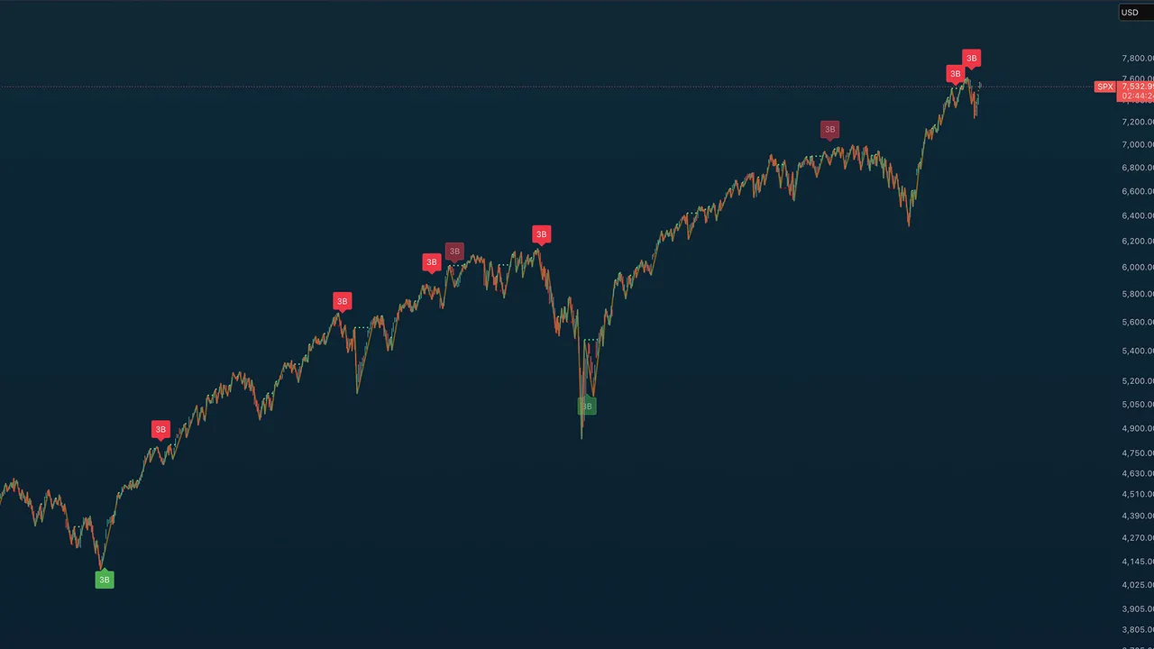
Gann 3-Bar Reversal Rule
Detects:
- Sell signal: 3 consecutive down bars off an ULTIMATE swing high
- Buy signal: 3 consecutive up bars off an ULTIMATE swing low
Only displays on daily, weekly, and monthly charts.
Signal strength tiers:
- Strict signal (full opacity) — 3 clean consecutive bars
- Liberal signal (50% transparency) — one inside/outside bar interrupted the sequence
Pre-sequence inside/outside bars (between the swing pivot and the first qualifying bar) are always allowed and don't weaken the signal.
The "Ultimate" filter requires the swing high (or low) to be the highest (or lowest) in the lookback window — default 100 bars. Increase for stricter signals. A cooldown prevents rapid re-firing during sustained moves.
Bar Type Markers (off by default)
Gann turning-point classification:
- 🟢 Green triangle up — up bar (higher high & higher low)
- 🔴 Red triangle down — down bar (lower high & lower low)
- ⚪ Gray circle — inside bar (lower high & higher low)
- 🔷 Blue diamond — outside bar (higher high & lower low)
Swing Data Labels
Optional date, time, price, range, and bar-count labels at confirmed swing pivots. Configure under Swing Data in settings.
Swing Moving Averages
Configurable short and long moving averages calculated from recent swing pivots (not every bar). Useful for confirming swing-based trend direction without the noise of bar-by-bar MAs.
Astrological Dates (off by default)
Optional vertical lines at Gann's major (solstice / equinox) and minor (cross-quarter) seasonal turning points, for traders who incorporate Gann's time cycles.
Alerts
Two alert conditions available:
- Gann 3-Bar Sell — fires on confirmed sell signal
- Gann 3-Bar Buy — fires on confirmed buy signal
TA Trend Ribbon
Overview
The TA Trend Ribbon is a SuperTrend-based dynamic trend follower built for clean identification of bullish and bearish market regimes. It uses ATR-adaptive stops with configurable directional bias presets, so it scales automatically across instruments and timeframes without re-tuning. Designed to complement (not duplicate) other trend tools by providing sharper trend flip detection and dynamic support/resistance bands.
Quick Start
Default settings are calibrated for daily and weekly charts on most major instruments. All features toggle independently in the indicator settings panel.
Settings Reference
Trend Bias Presets
Three presets control the asymmetric stop multipliers based on your market thesis:
- Neutral (default) — symmetric stops (3.0 / 3.0); balanced sensitivity
- Bullish Bias — wider bull stop (4.0) + tighter bear stop (2.5). Uptrends persist through pullbacks; flips back to bull quickly
- Bearish Bias — mirror (2.5 / 4.0); downtrends hold longer, filtering out failed bounces
In strong uptrends, Bullish Bias keeps you in the trade through normal corrections. In bear markets, Bearish Bias filters out failed bounces.
Price Source
Five source options for the underlying trend calculation:
- Close — closing price (most reactive to end-of-bar moves)
- Open — opening price
- HL2 — Median Price,
(high + low) / 2(default — what classic SuperTrend uses) - HLC3 — Typical Price,
(high + low + close) / 3(smoother than HL2) - OHLC4 — Average Price,
(open + high + low + close) / 4(smoothest)
Core Parameters
- Source Smoothing (EMA period) — default 2; lightly smooths the source
- ATR Period — default 10; drives the dynamic stop distance
- Ribbon Band Width (× ATR) — default 0.5; controls ribbon thickness
Display Options
All toggle independently:
- Show ribbon band — filled colored area showing the trend zone
- Show center trend line — the active SuperTrend stop level
- Show trend flip arrows — triangle markers at trend changes
- Color price bars by trend — paints candle bodies by direction
- Background tint by trend — subtle pane background coloring
Colors
Defaults match common trend-indicator conventions: bullish blue / bearish orange. Ribbon fill, trend line, and background transparency are all independently configurable.
Usage Tips
The ribbon doubles as dynamic support/resistance:
- When the orange ribbon sits above price, it acts as a resistance zone
- When the blue ribbon sits below price, it acts as a support zone
Use on higher timeframes (4H / Daily / Weekly) for cleaner trend reads. On lower timeframes (15m / 1H), expect more noise from ATR-driven flips.
For confluence-based entries, watch for trend flips that align with other signals from your toolkit (volume, RSI, market structure breaks).
Alerts
Two alert conditions available:
- Bullish Trend Flip — fires when trend changes to bullish
- Bearish Trend Flip — fires when trend changes to bearish
TA Adaptive Trend
Overview
TA (Miles) Adaptive Trend is a volatility-gated trend follower built on a 21/55 EMA pair, but the colored zone is not a raw EMA cross. A multi-factor decision engine blends multi-timeframe RSI, volume, divergence, and trend-context signals (EMA cross/stack/slope, ADX, ATR regime, higher-timeframe bias) into one signed confluence score, and the zone flips when that score crosses a threshold. So the zone can flip before the cross (anticipate), after it (confirm), or on its own when the weight of evidence shifts. The EMAs are a visual reference; the colored zone is the engine's verdict.
Quick Start
Defaults are tuned for the daily chart and work well on 4H and weekly. Add the indicator, leave Decision profile on Balanced, and read the colored fill between the EMAs: mint-green for an engine-confirmed uptrend, orange for a downtrend, gray for neutral. Want earlier signals? Switch the profile to Lead. Want more corroboration before the zone turns? Use Confirm.
Settings Reference
Trend
- Fast EMA — default 21; the faster average.
- Slow EMA — default 55; the slower trend anchor.
Decision Engine
- Decision profile — Lead / Balanced / Confirm. The single control over how the engine commits. Lead lowers the thresholds and adds a momentum lead bias so the zone anticipates the cross. Balanced sits near the cross. Confirm raises the thresholds and waits for corroboration before flipping. The advanced engine knobs (factor weights, individual factor toggles, multi-timeframe settings, the anti-fakeout trend lock) are tuned and locked under the hood, so this profile is all most users need.
Display
- Info table — on-chart readout of trend state, net score, active profile, EMA stack, the per-group reads, ADX, bars since the last flip, and the trend-lock status.
- Info table position — place the table anywhere on the chart (the four corners plus top/bottom center and middle left/right).
- Tint background by state — off by default. A faint mint-green/orange wash across the pane that matches the zone, for an at-a-glance regime read.
- Flip markers (triangles) — off by default. Small teal/red triangles (no text) on each confirmed zone flip; turn them on if you want an explicit trigger mark.
Reversion Targets (reverse-RSI)
Off by default. Optional trailing lines that answer "how far must price move before a faster timeframe goes oversold or overbought?" The next close that would push each timeframe's RSI to the target is solved by inverting Wilder's RSI; oversold lines paint below price, overbought lines above.
- Show reversion target lines (master) — the master switch for the whole feature.
- Auto TFs (2 steps down ladder) — reads the two timeframes below your chart automatically (Daily reads 4H and 1H). Turn off to set the timeframes manually.
- Manual TF1 / TF2 — the two timeframes to read when Auto is off.
- Oversold / Overbought target — the RSI levels the lines solve toward (default 30 / 70).
- OS/OB TF1/TF2 visible — each of the four lines shows independently: Always, Never, On uptrend, or On downtrend.
- Label lines — print the timeframe and target price at the chart edge.
Usage Tips
Use the colored zone as your regime read. Because the engine weighs more than the cross, expect the zone to lead or lag the literal EMA cross depending on your profile — that is the point. Turn on the info table to see why the engine is where it is: the per-group reads show whether RSI, volume, divergence, or trend context is driving the call. The reversion target lines pair well with the zone — in an uptrend, the oversold lines below price mark where a pullback would arm a faster-timeframe oversold, a natural spot to watch for continuation.
Strategy Integration
The indicator exports its trend state and flip events as Data Window plots (Export Trend State, Export Bull Flip, Export Bear Flip), so you can wire them into companion strategy scripts via input.source(). These export titles are unchanged from the prior version, so existing strategy links keep working.
Alerts
Two conditions: Bull trend flip and Bear trend flip — confirmed engine flips only, never raw crosses.
TA Moving Averages
Overview
TA Moving Averages is an all-in-one moving-average overlay: eight timeframe-anchored MAs — the 20 / 50 / 100 / 200 day and the 20 / 50 / 100 / 200 week — plus five fully customizable slots, all on one indicator. The point of difference is that every predefined MA is calculated with request.security, so it shows the correct daily or weekly value no matter what timeframe your chart is on. The 200-day reads the true daily 200-period SMA whether you are viewing a 5-minute, hourly, daily, or weekly chart — no switching timeframes to check where the big averages sit.
This tool is free and public on TradingView — no access request needed.
Quick Start
Add the indicator to any chart and any timeframe. The eight anchored MAs plot immediately; the five custom slots are off by default. Each line has its own toggle and color picker in settings.
The Averages
Daily structure
- 20-Day (bright pink) — short-term reference
- 50-Day (royal blue) — common swing reference
- 100-Day (deep orange) — stronger short-term floor
- 200-Day (yellow) — the most-watched long-term trend line across equities and crypto
Weekly structure
- 20-Week (green) — accumulation zone often defended during pullbacks
- 50-Week (cyan) — primary long-term trend filter; above is structural bull, below is structural bear
- 100-Week (amber) — intermediate structural zone for multi-year cycles
- 200-Week (purple) — long-term structural anchor and the classic bull-market floor for crypto
Custom slots
Five extra slots, each with any length, SMA or EMA type, a Chart / Daily / Weekly anchor, and a color picker. Off by default — enable a 34 EMA, an 89-day Fibonacci reference, a 300-week anchor, or whatever your method calls for.
Usage Tips
Day traders lean on the 20D / 50D for intraday support and resistance. Swing traders use the 50D / 100D with the 20W / 50W for cycle structure. Position traders watch the 100W / 200W as long-term anchors. The weekly MAs reveal structure best on daily and weekly charts.
Notes
All MAs use lookahead off, so there is no repaint risk. Values are kept out of the chart legend to keep the title clean (still visible on the price scale and in the Data Window).
TA Benner Chart
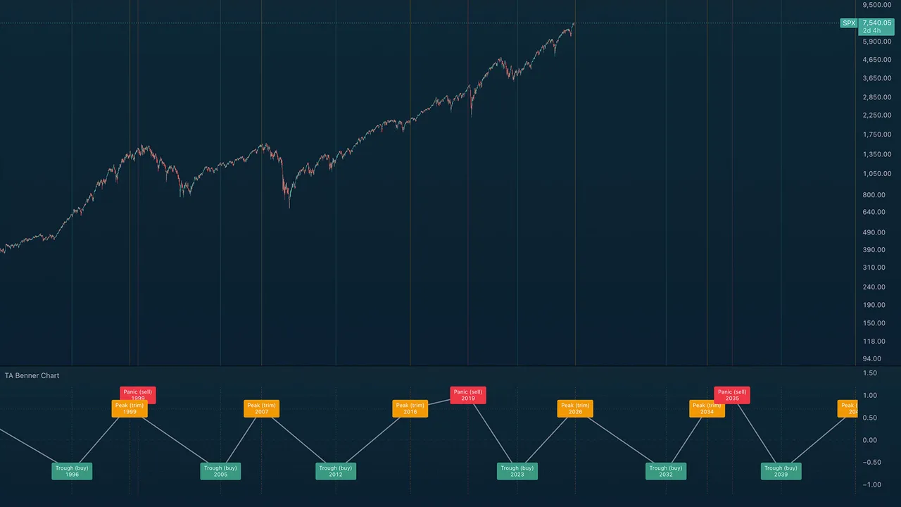
Overview
TA Benner Chart renders Samuel Benner's 1875 commodity-cycle forecast directly on your chart, with projections through 2100. Three repeating periodicities mark major turning points: Panic years (sell), Peak years (trim), and Trough years (buy). For context, 1929, 1965, 1981, the 1999 dot-com peak, the 2007 top, the 2012 trough, and the 2019–2020 panic setup all landed close to Benner's original projections.
Quick Start
Add the indicator and open a monthly chart for the full multi-decade sweep, or a weekly chart for recent-cycle detail. The lower pane carries the action-coded event labels and a connecting wave line that traces the rhythm; the price chart gets subtle vertical reference lines at each event year.
The Three Cycles
- A — Panic years (red, sell): speculative crashes, repeating 18-20-16 year gaps. Next: 2035, 2053, 2073, 2089.
- B — Peak years (orange, trim): good times and high prices, repeating 9-10-8 year gaps. Next: 2026, 2034, 2043, 2053, 2061, 2070, 2080.
- C — Trough years (green, buy): hard times and accumulation, repeating 7-11-9 year gaps. Next: 2032, 2039, 2050, 2059, 2068, 2079.
Intra-Year Placement
Each event sits inside its year at the point most useful for the implied action. Sell events plot at year-end, after a speculative blowoff has had time to play out. Trim events plot at mid-year, giving holders the back half of the year to ladder out. Buy events plot at the start of the year, accumulating before the cycle turns.
How to Read
Watch the wave in the pane for the underlying rhythm, cross-reference the vertical lines against actual market tops and bottoms, then plan around the future projections.
Notes
These cycles span 7 to 20 years — use monthly charts for the full sweep and weekly for recent detail. Like any cycle theory, Benner's is an approximation: wars, pandemics, and monetary regime changes can shift turning points by a year or two. Treat it as a directional anchor for long-cycle work, not a precision timing system.
TA Closing Hour Pulse
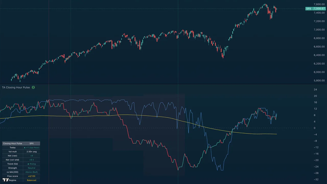
Overview
A pane indicator measuring institutional flow from the final hour of each session — the closing hour (roughly 3pm to 4pm ET), when institutional desks position for the next day. Each closing hour is scored by direction and weighted by its volume, then summed over a rolling window into a pulse line that rises during accumulation (buying the close) and falls during distribution (selling the close). A normalized S&P 500 comparison line is drawn in the same pane: divergence between the pulse and price — hidden accumulation (pulse up, price down) and hidden distribution (pulse down, price up) — is the key signal and often precedes multi-week trend reversals.
Quick Start
- Open a daily chart of any liquid US-listed asset (best results on
SP:SPX,NASDAQ:NDX,AMEX:SPY,NASDAQ:QQQ, or large-cap stocks) - Add the indicator
- Read the smart money line vs price — sustained divergences are the actionable signal
- Check the top-right table for current readings at a glance
The indicator only runs on daily timeframe or higher. It pulls 60-min data internally to identify each session's closing hour.
How It Works
For each daily bar:
- Pulls every 60-min bar within that day's regular session
- Takes the last hourly bar — the closing hour (3:00pm–4:00pm ET for US indices)
- Records a raw read: +1 if it closed up, −1 if down, 0 if flat
- Optionally multiplies by today's last-hour volume ÷ N-day average last-hour volume (so high-volume hours count more)
- Sums the weighted reads over a rolling window (default 90 sessions)
That windowed net is the pulse line in the indicator's own pane. (A running total from the start of all history would drift unbounded and blow the pane scale, so the line is windowed and re-bases like the Discord screener's view.) A separate recency-weighted oscillator — the same engine as the companion TA Closing Hour Tide — drives the Flow score and Regime shown in the table.
Settings Reference
Source
- Symbol override — leave blank to use the chart's symbol. Override only if you want the pulse calculated on a different symbol than what's on the chart (e.g. show SPY's pulse on an SPX chart).
Volume
- Weight by last-hour volume (when available) — when on, scales each ±1 read by relative last-hour volume. A +1 day on 1.5× normal volume counts as +1.5; a +1 day on 0.4× normal volume counts as +0.4. Auto-disabled for cash indices (SPX, NDX) which have no volume — falls back to plain ±1, and the table shows "n/a (no vol)".
- Volume average lookback (sessions) — default 20; the lookback used to compute "normal" last-hour volume.
Display
- Pulse window (sessions) — default 90; the rolling window the pulse sums over. (A running total from the start of history drifts unbounded and blows the scale, so the line is windowed.)
- Smoothing MA length — default 200 (a 200-period SMA of the pulse line); set to 0 to hide it.
- Color line by direction — green when rising, red when falling.
- Show readout table — the info panel (described below).
- Put readout table on the price chart — off by default; the table sits in the indicator's own pane, out of the price action. Turn on to overlay it on price.
- Table position — which corner; a Left position keeps it clear of the latest prints.
- Show S&P 500 price comparison line and Comparison normalize lookback — the price overlay and the window used to scale it into the pulse's range. It is a solid line (Pine cannot dash a continuous plot); set it to Dashed in the Style tab if you prefer that look.
Colors
Configurable bullish, bearish, and MA colors. Defaults match standard trend conventions (green / red / orange).
Reading the Smart Money Line
The line is calibrated so its position relative to price is the signal:
| Pattern | Meaning |
|---|---|
| Line and price both rising together | Institutions and market in agreement — trend likely to continue |
| Line and price both falling together | Same, on the downside |
| Line rising while price falling | Hidden accumulation — institutions buying weakness silently |
| Line falling while price rising | Hidden distribution — institutions selling into strength |
| Line crosses above its MA | Bias regime turning bullish |
| Line crosses below its MA | Bias regime turning bearish |
| Line flat, price volatile | Institutional indecision — wait for direction |
The two divergence cases (bolded) are the most valuable. They often precede multi-week trend changes by 1–3 weeks.
The Readout Table
The top-right table summarizes the current state at a glance:
| Row | Example | What it tells you |
|---|---|---|
| Header | Closing Hour Pulse / SPX |
The indicator name and active symbol |
| Today | ▲ +1 (Up Hour) |
Direction of today's closing hour |
| Vol mult | 1.42× avg or n/a (no vol) |
How heavy today's last-hour volume was vs the 20-day average |
| Net (raw) | +27 |
Net of the raw ±1 reads over the window |
| Net (vol-wtd) | +40.5 |
Same, volume-weighted (only when volume exists) |
| Trend (5d) | ▲ Rising |
5-day slope of the pulse line |
| Strength | Strong Bull |
5-day slope magnitude (Strong / Moderate / Neutral) |
| vs MA(200) | Above (Bull) |
Whether the pulse is above or below its smoothing MA |
| Flow score | +4/100 |
Recency-weighted bias, −100 to +100 (matches TA Closing Hour Tide) |
| Regime | Balanced |
Strong Buying / Buying / Balanced / Selling / Strong Selling |
Volume Notes
- SPX, NDX (cash indices) — no volume data exists in TradingView for these. Indicator auto-falls back to raw ±1. Still useful, but volume-weighted is more precise.
- SPY, QQQ (ETFs) — full volume data. Volume-weighted signal works.
- ES1!, NQ1! (futures) — full volume data, but futures trade nearly 24h. The "last hour" definition still maps to 3pm–4pm ET, which captures the cash close volume spike correctly.
- Individual stocks — works on any liquid US equity with a normal 9:30–4:00 ET session.
For the cleanest read of broad-market institutional flow, run it on SPY and QQQ side by side.
Best Practices
- Don't trade single readings. The line's value is in its trend and its divergence vs price, not in any one day's read.
- Pair with other tools. The Trend Ribbon tells you the active regime; the Smart Money Line tells you whether institutions agree with it. Confluence is strongest when both align.
- Watch the strength rating, not just direction. A "Strong Bull" reading during a price pullback is a high-conviction long setup. A "Neutral" reading is just noise.
- Use alerts for crossovers. Set the "Pulse crossed above/below MA" alerts on your watchlist symbols — those crosses mark regime transitions worth investigating.
Alerts
Four alert conditions available:
- Last hour flipped bullish — first up-hour after a stretch of flat/down hours
- Last hour flipped bearish — first down-hour after a stretch of flat/up hours
- Pulse crossed above MA — smart money line crossed above its smoothing MA (bias turning bullish)
- Pulse crossed below MA — smart money line crossed below its smoothing MA (bias turning bearish)
TA Closing Hour Tide
Overview
The companion oscillator to TA Closing Hour Pulse. Where the Pulse plots the running trend of closing-hour institutional flow, the Tide bounds that same flow into a −100 to +100 reading so you can gauge how strongly, and how recently, the closing hour has leaned to one side. It stacks directly beneath the Pulse pane.
Quick Start
- Add it to the same chart as TA Closing Hour Pulse — it opens in its own pane.
- Read it like an oscillator: green and rising above zero is net buying into the close; red and falling below zero is net selling.
- Watch the bands and the score label for how committed the bias is.
How It Works
Each session's closing hour is scored +1 (up) or −1 (down), weighted by that hour's volume vs its 20-day average (clamped 0.3× to 2.5×). Those scores are smoothed with a recency-weighted EWMA (the last ~5 to 10 sessions lead), then scaled and clamped to −100 to +100. The latest value is the Flow score — the same number shown in the Closing Hour Pulse table.
Settings Reference
- About — hover the info icon for a built-in summary of what it measures.
- Source — symbol override; keep it matched to TA Closing Hour Pulse.
- Volume — weight by last-hour volume, and the averaging lookback.
- Display — show the score label, and shade the regime zones.
- Colors — Buying (green), Selling (red), Balanced / neutral (grey).
Reading the Tide
| Zone | Reading |
|---|---|
| Above +50 | Strong Buying — heavy, one-sided accumulation into closes |
| +18 to +50 | Buying — committed accumulation |
| −18 to +18 | Balanced — no clear closing-hour bias |
| −50 to −18 | Selling — committed distribution |
| Below −50 | Strong Selling — heavy distribution into closes |
Alerts
Four conditions: the Tide crossing into Buying (+18) or Selling (−18), and reaching Strong Buying (+50) or Strong Selling (−50).
Stack Attack
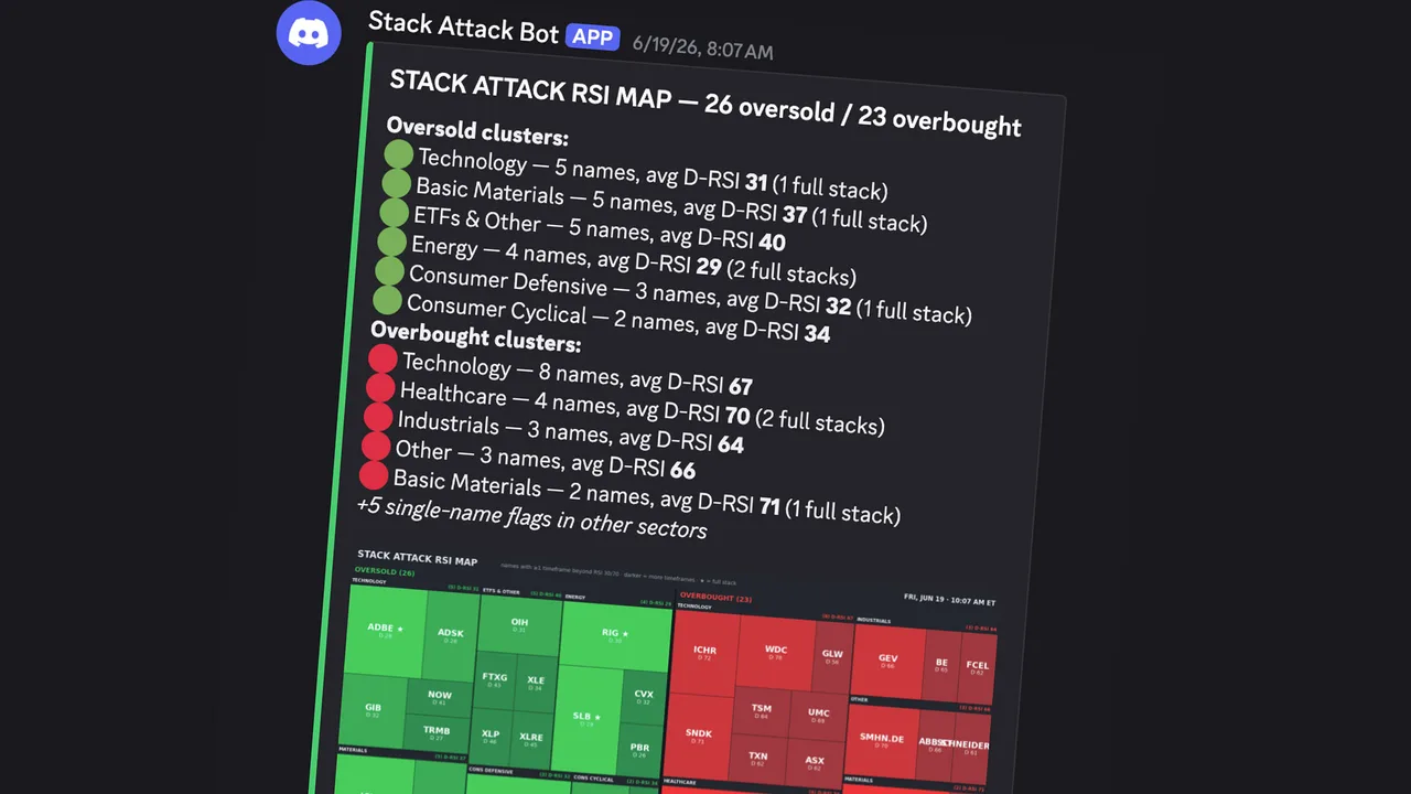
Channel: #stack-attack
What it does — Scans 367 equities and 76 cryptocurrencies for RSI extremes across multiple timeframes using the Wilder RSI. When the 1-hour, 4-hour, and daily charts all read oversold (below 30) or overbought (above 70) at the same time, it fires. A stock can be oversold on one timeframe easily, but when all three align it often marks a genuine extreme.
How to read it — Oversold alerts are green, overbought are orange. Each shows the ticker, asset type (EQUITY, ETF, or CRYPTO), and the RSI across confirmed timeframes. When the weekly RSI also confirms, it upgrades to a brighter "WEEKLY STACK ATTACK" — the rarest and most significant signal. A once-per-day cooldown per ticker per direction prevents repeats.
The visualization — Alongside the alerts, a Stack Attack RSI map plots every flagged name as a tile, grouped into oversold (green) and overbought (red) sector blocks; the darker the tile, the more timeframes are stacked, and a ● marks a full stack. A cluster summary above the map lists the sectors with the most oversold and overbought names and their average daily RSI, so you can see where pressure is building rather than reading names one at a time.
When it runs — Equities at 10:00 AM and 4:00 PM ET. Crypto at 8:00 AM and 8:00 PM ET, plus a special weekly scan Sunday evening after the weekly RSI prints.
Premarket Movers
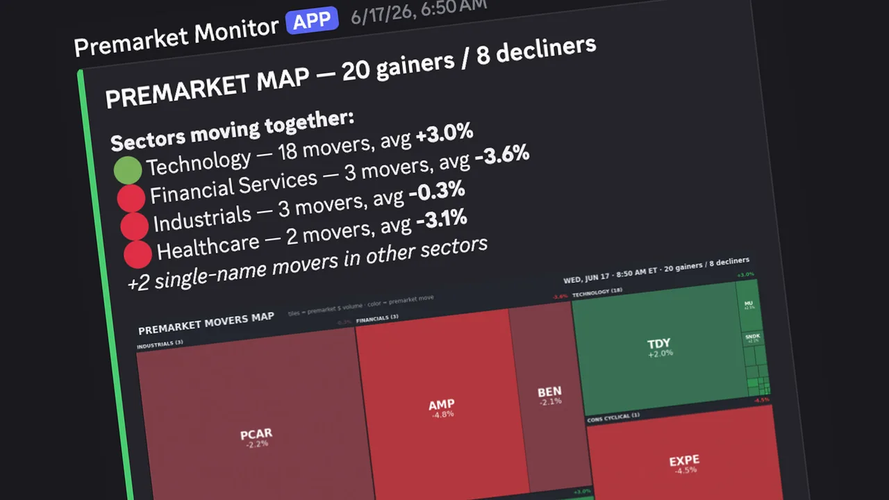
Channel: #pre-market-movers
What it does — Pulls data on roughly 583 tickers (all S&P 500 and NASDAQ 100 components plus a community watchlist of high-interest names), compares each stock's premarket price to its previous close, and flags significant movers.
How to read it — Each alert shows the ticker, percentage change, previous close, current premarket price, premarket volume, and the volume ratio versus the stock's 10-day average. Tier 1 (bright green) flags moves of +4% or more on meaningful volume; Tier 2 (dark orange) flags +2% to +4%. The volume ratio is the key differentiator — a +5% move on 3x average volume is far stronger than the same move on thin volume. An "EARLY" label marks the first scan of the day.
The visualization — Each alert leads with a Premarket Movers heat map: every flagged name is a tile sized by its premarket dollar volume and colored by its move (green up, red down), grouped into sector blocks. Above the map, a "Sectors moving together" summary lists which sectors are moving as a group and their average move — so one glance tells you whether strength is broad or concentrated in a single name.
When it runs — 7:00 AM ET (early scan) and 8:45 AM ET (final scan, ~30 minutes before the open).
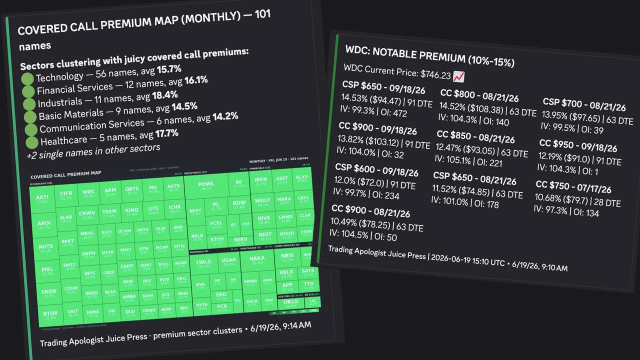
Juice Press (Monthly)

Channel: #juice-press
What it does — Scans ~300 equities for covered-call and cash-secured-put premiums on the next three monthly expirations, identifying contracts with unusually high premiums relative to the stock price. It checks five strikes out-of-the-money on each side, with increments scaled to share price. Each ticker is cross-referenced against institutional options flow — when a qualifying premium coincides with unusual activity, it is tagged "Unusual Flow" (and "sweeps detected" when aggressive sweep orders appear) for added conviction.
How to read it — Each ticker gets its own window with the stock price and qualifying contracts in bold: contract type (CC or CSP), strike, expiration, premium as a percent and dollar amount, days to expiration, implied volatility, and open interest. Tier 1 (bright green) flags premiums of 15%+; Tier 2 (dark green) flags 10–15%. Below 10% is filtered out.
Sector heat maps — After the alert, two sector maps post: a Covered Call map and a Cash-Secured Put map. Each flagged name is a tile sized by its premium yield and colored by juiciness (brighter green = richer), grouped into sector blocks, with a summary of which sectors have the most juicy names. Use them to spot when premium is clustering in a sector (often a volatile group like materials, miners, or uranium) so you can focus your covered-call selling there.
When it runs — 11:00 AM ET daily (90 minutes after the open, letting early volatility settle).
Juice Press (Weekly)
Channel: #juice-press-weekly
What it does — The same engine as the monthly scanner, focused on weekly expirations. It scans the next four weekly Fridays, excludes monthly expirations to avoid overlap, and skips contracts with fewer than two days left. Tickers without weekly options are filtered out. Also cross-references institutional flow with an "Unusual Flow" tag.
How to read it — Format is identical to the monthly guide. The thresholds are lower to reflect the shorter horizon: Tier 1 (bright green) at 5%+ (extremely juicy for a weekly), Tier 2 (dark green) at 3–5%.
The visualization — Like the monthly scan, it posts Covered Call and Cash-Secured Put sector heat maps: each flagged name is a tile sized by its premium yield and colored by juiciness (brighter green = richer), grouped into sector blocks, with a summary of which sectors hold the most juicy weeklies.
When it runs — 10:00 AM ET daily (one hour before the monthly scan).
Rotation Radar
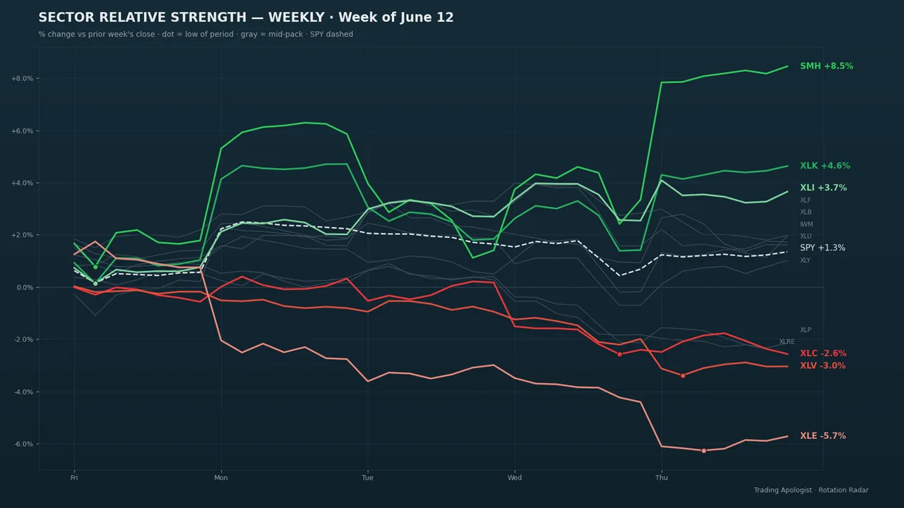
Channel: #rotation-radar
What it does — Tracks 19 core sector ETFs and 22 sub-sector ETFs against SPY. For each it calculates 1-day, 5-day, and 20-day percentage change and classifies it as an inflow (outperforming SPY over five days) or outflow. It also pulls real institutional dollar-flow data per ETF, shown as a "Flow" line.
How to read it — Up to five embeds: a gold HIGH CONVICTION embed first when applicable, then Core and Sub-Sector Inflows (green), then Outflows (red). Within each, divergence signals sort to the top. Divergence signals: "Buying the Dip" means a sector is weak on price but institutions are adding $50M+ (large players see value); "Selling into Strength" means it is strong on price but institutions are pulling $50M+ out. High Conviction (14-day lookback): when a sector shows divergence on 5+ of the last 14 days it is flagged gold — sustained conviction carries far more weight than a single day. Broad sell-off alerts: a background breadth monitor tags everyone if 80%+ of sectors sell off simultaneously, and highlights any sectors still accumulating.
The visualization — The report leads with a Sector Relative Strength chart: each sector ETF's percentage change versus the prior period drawn as a line — green for the outperformers, red for the laggards, gray for the mid-pack — with SPY as a dashed benchmark and a dot marking each line's low of the period. One glance shows which sectors money is rotating into and out of relative to the index.
When it runs — Full report once daily at 4:00 PM ET. The breadth monitor runs every 15 minutes during market hours (9:30 AM–4:00 PM ET) but only posts when the 80% threshold is crossed.
Squeeze Signal
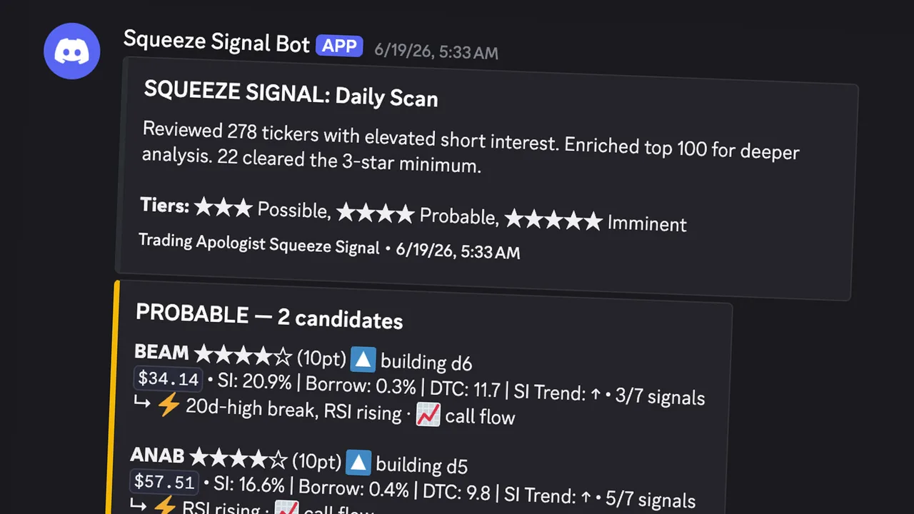
Channel: #squeeze-signal
What it does — Scans the US equity market premarket and flags stocks with the structural setup for a short squeeze, ranked Possible → Probable → Imminent on a composite score of eleven factors. A second layer checks each candidate for multi-day accumulation patterns and calls those out separately on a Watchlist.
How to read it — One embed per tier, color-coded: Blue (Possible, 7–9 pts), Gold (Probable, 10–12), Green (Imminent, 13–15), Purple (Watchlist — names showing accumulation). Below three stars, nothing posts. Each line shows the ticker, star rating, points, price, short interest as a percent of float, borrow fee, days to cover, a short-interest trend arrow, and how many accelerant factors are firing. A ⚠️ EXTENDED tag means the stock has already run (more than 40% above its 30-day low and 25% above its 50-day MA); its score is docked two points. The Watchlist answers a different question than the tiers: not "which names have the setup" but "which of those setups are actively building right now." Watchlist names are the ones to chart first.
When it runs — 7:30 AM ET, weekday mornings (FINRA short-interest data updates twice monthly, so premarket timing gives you a full hour to prep). Squeeze Signal surfaces setups, not outcomes — many candidates never squeeze. The trade decision stays with you.
Market News
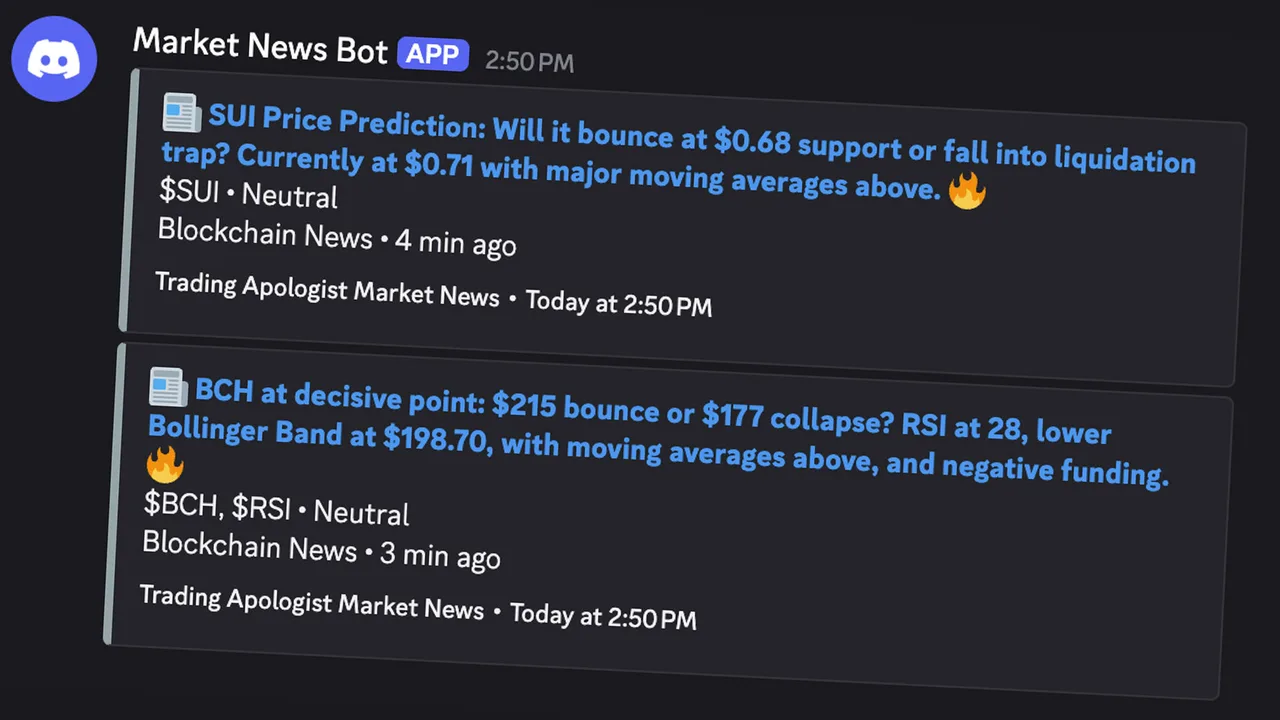
Channel: #market-news
What it does — Pulls market-moving headlines from the news feed and posts the ones relevant to our universe in real time — recognized by a watchlist ticker, a followed company name, or a high-impact keyword. This keeps the channel focused on news that touches tradable names rather than the full firehose.
How to read it — Each post is a single headline with its source and tickers, linked to the story. High-impact headlines (mergers, guidance changes, regulatory actions, major macro events) are marked so they stand out. Treat it as a live wire: a sudden cluster of headlines on one name is often your first heads-up before it shows in price.
When it runs — Every 5 minutes, around the clock. De-duplicated on headline and ticker so stories never repeat.
Insider Intel
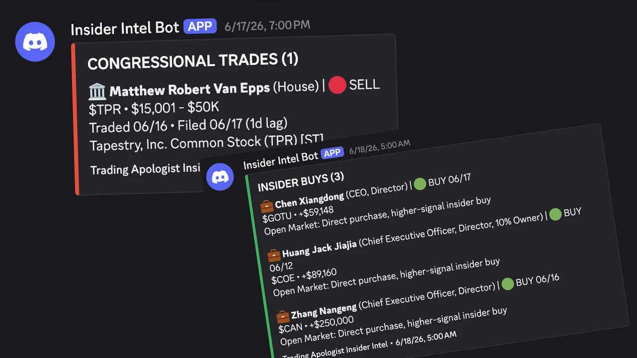
Channel: #insider-intel
What it does — Tracks two of the highest-signal forms of "smart money" disclosure: corporate insiders trading their own stock (SEC Form 4) and members of Congress reporting trades. Both are public record but scattered and slow to reach most traders.
How to read it — Corporate insiders: ticker, the insider's name and role, buy or sell, dollar value, and filing date. Insider buying is the stronger signal (insiders sell for many reasons but buy for one), and cluster buying carries the most weight. Congressional trades: the member, ticker, direction, and disclosed dollar range. Daily digest: a once-a-day recap of the day's activity, the largest buys and sells, and active clusters over the last 30 days. Cluster alerts fire (and tag the server) when several insiders or members trade the same name in a tight window, with false-positive filtering.
When it runs — Corporate scans at 7:00 AM and 8:00 PM ET; congressional scans at 8:00 AM and 9:00 PM ET; the daily digest at 9:15 PM ET on weekdays.
Whale Alerts
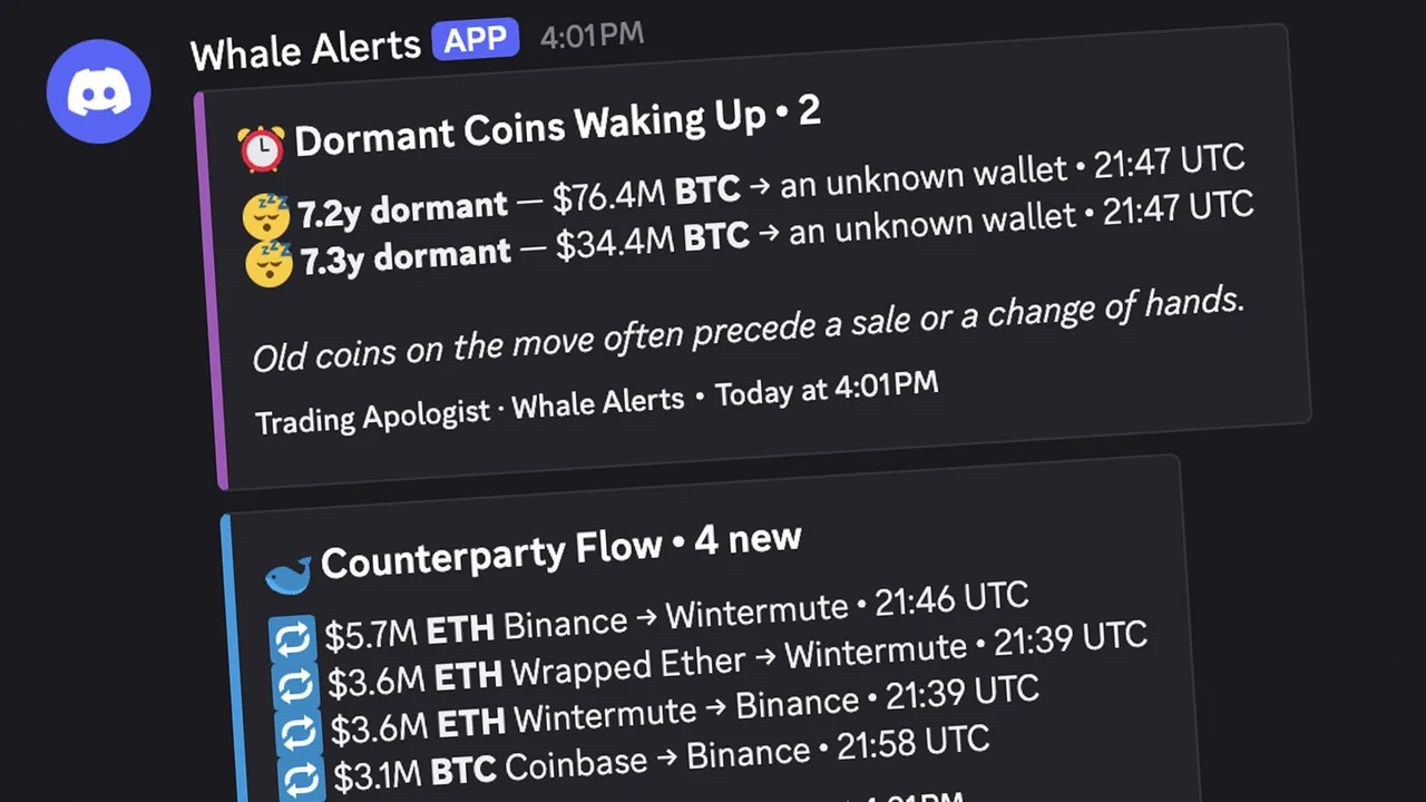
Channel: #crypto-whale-alerts
What it does — Tracks large cryptocurrency movements in real time across the major coins (Bitcoin, Ethereum, Solana, XRP, and other top names). Rather than posting every transfer, it filters to the moves that carry a signal and sorts them into three types.
How to read it — Counterparty Flow: a large transfer where one side is a known entity (exchange, custodian/ETF, fund, treasury, government wallet, or bridge). Coins moving to an exchange often signal selling pressure; moving off an exchange often signals accumulation. Dormant Coins Waking Up: coins untouched for years suddenly moving, which often precedes a sale or change of hands — the alert shows how long the wallet was dormant. Large Transfer Volume: a heat alert when whale activity in the last hour spikes well above its normal pace, which often lines up with volatility. Daily Recap (00:00 UTC): total whale volume, net exchange flow, dormant wallets woken, the most active coins, and the biggest single moves — the fastest read on which way the whales leaned.
When it runs — Intraday alerts every 30 minutes, all day; the daily recap once a day at midnight UTC.
Dark Pool Tracker
Channel: #dark-pool-tracker
What it does — Monitors institutional dark-pool transactions across the full watchlist (~315 tickers), scanning for block trades with premiums above $500,000 and classifying each as a likely buy or sell based on where it executed relative to the NBBO midpoint. (The NBBO is the tightest bid and offer across public exchanges; the midpoint is halfway between. Above the midpoint, the buyer is paying up — buying intent. Below it, the seller is accepting a discount — exit urgency.)
How to read it — Each scan produces two embeds: a green "LIKELY BUYS" (executed at/above midpoint) and a red "LIKELY SELLS" (at/below), with total dollar volume per side. Each print shows the ticker, dollar size, and classification (LIKELY or LEAN BUY/SELL), plus share count, execution price, the NBBO at execution, the time in ET, and a chart link. LIKELY (at the ask or bid) is the strongest signal; LEAN indicates intent with less certainty. 5-day cluster detection: when a ticker prints on 3+ of the last 5 days with over $1M total premium, it is tagged a CLUSTER — sustained institutional activity carries far more weight than a single print.
When it runs — Every 30 minutes, 8:00 AM–6:00 PM ET, weekdays. Each print has a 24-hour cooldown so trades are never double-reported.
Pork Barrel
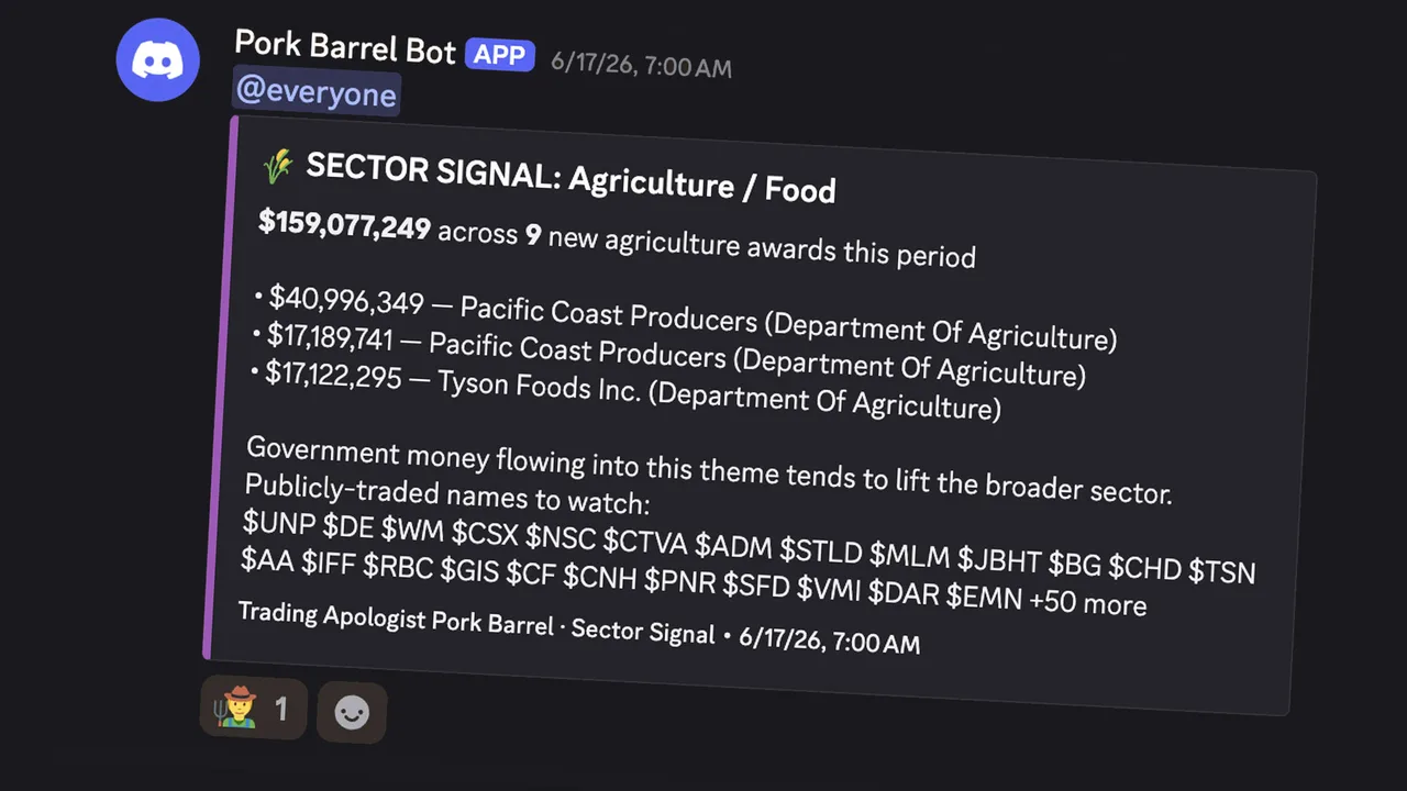
Channel: #pork-barrel
What it does — Scans USAspending.gov for new federal contract awards going to public companies, and flags large allocations to entire sectors. Contracts hit the public record hours or days before the financial wires, and a sizeable award can be a real catalyst for a small or mid-cap.
How to read it — Contract awards: when a company under $10B market cap wins a contract of $10M+, it posts an alert — green "Major" for $20M+, orange "Notable" for $10–20M — with the matched ticker, recipient name as filed, awarding agency, date, sector/industry, market cap, NAICS code, work description, and a link to the record. Sector Signals: for very large allocations (including ones to private players like SpaceX or Anduril you cannot trade directly), it points you instead at the public names across the Russell 3000 and S&P 500 in that theme — drones, space, nuclear, defense, biodefense. How to use it: a starting point, not a signal on its own. Confirm the ticker matches, weigh the contract against the company's revenue, and read the description (a multi-year base contract differs from a one-time delivery order).
When it runs — Twice daily on weekdays, 9:00 AM and 5:00 PM ET. Individual awards are rare by design; Sector Signals rarer still.
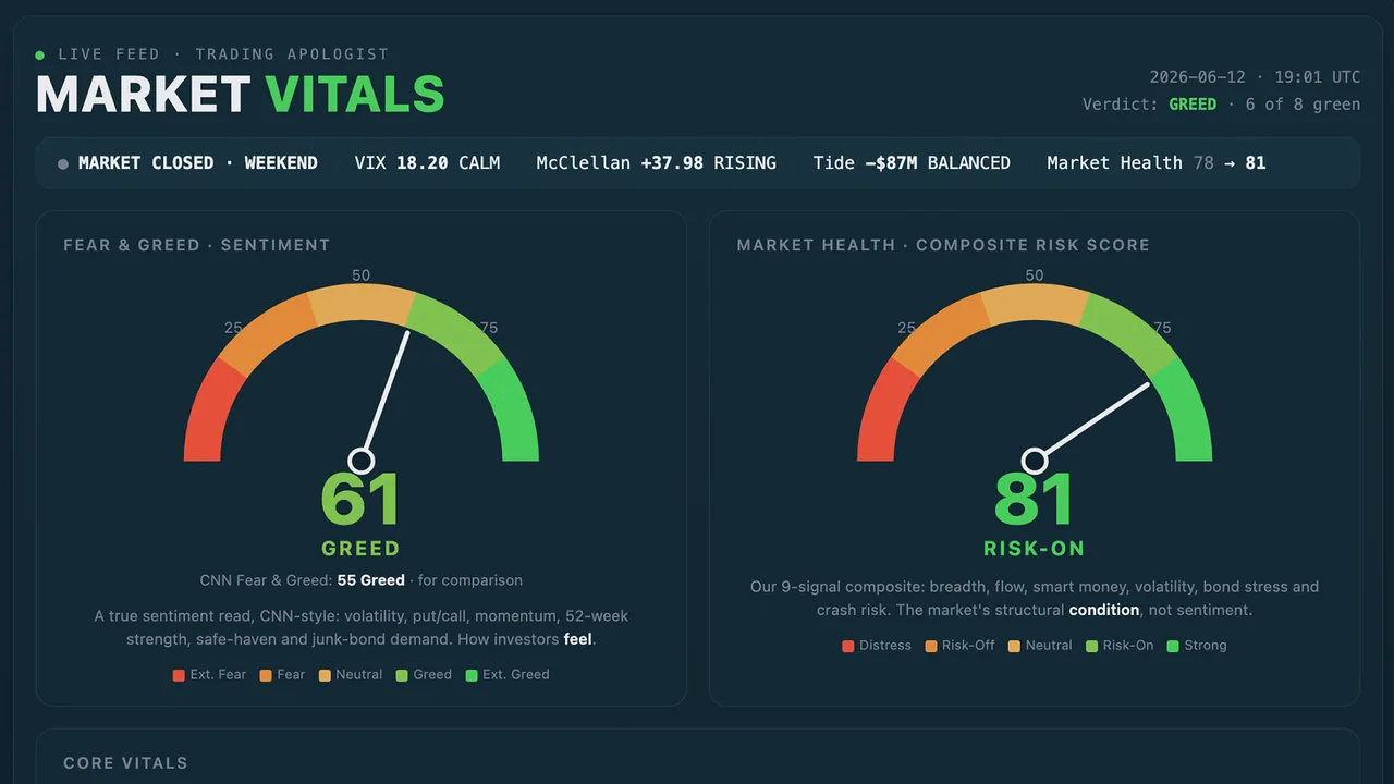
Market Vitals
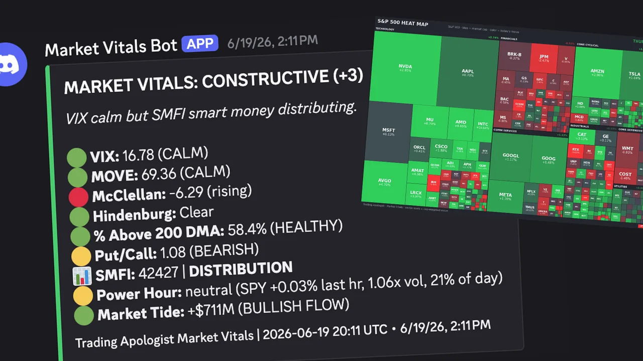
Channel: #market-vitals
What it does — Monitors seven institutional-grade market-health signals and posts a daily status report, firing individual alerts when critical thresholds cross (the most urgent tag everyone). It is designed to stay quiet on normal days — think of it as the market's vital-signs monitor. Green means go about your day; a red alert means look at your positions.
The seven signals — VIX (fear gauge: below 20 calm, above 40 historically a strong buy-the-dip), MOVE (bond-market stress: above 150 is crisis territory), McClellan Oscillator (breadth momentum: below −100 deeply oversold), Hindenburg Omen (split-market warning — clusters of 3+ in 30 days matter, not single signals), Percent Above 200-DMA (participation: below 25% a contrarian buy zone, above 85% extended), Put/Call Ratio (sentiment: above 1.2 extreme fear, below 0.7 complacency), and the Smart Money Flow Index (compares the first 30 minutes of trading to the last 60 to spot accumulation vs distribution). A Momentum Pulse reading also shows the percentage of S&P 500 stocks above their 12, 20, and 50-day averages.
How to read it — A single color-coded embed: green healthy, yellow approaching a threshold, red at an extreme. Threshold crossings fire a detailed alert on a 24-hour cooldown. The @everyone-level signals are VIX above 40, MOVE above 150, a Hindenburg cluster, and a significant Smart Money divergence. (McClellan, Hindenburg, and Smart Money Flow need several weeks of history to become fully meaningful; VIX, MOVE, Put/Call, and breadth work immediately.)
When it runs — Five times daily at 9:00, 11:00 AM, 1:00, 3:00, and 4:00 PM ET, weekdays.
Cycle Peak Doom Clock (also in #market-vitals)
The long-term companion to Market Vitals. Where Vitals reads the daily signs, the Doom Clock steps back and asks how late we are in the overall market cycle. It tracks seven categories that historically cluster near major tops (Rotation, Breadth, Volatility, Rates & Credit, Macro, Sentiment, Valuation) and rolls them into a single Cycle Peak Risk percentage, shown as a clock ticking toward midnight: under 30% Early/Mid Cycle, 30–50% Maturing, 50–70% Late Cycle, 70–85% Peak Risk Elevated, above 85% Peak Risk Extreme. It is a context tool, not a trade signal — and the most valuable read is the week-to-week change, since tops form over months. Posts every Friday at 6:30 PM ET.
Earnings Pulse
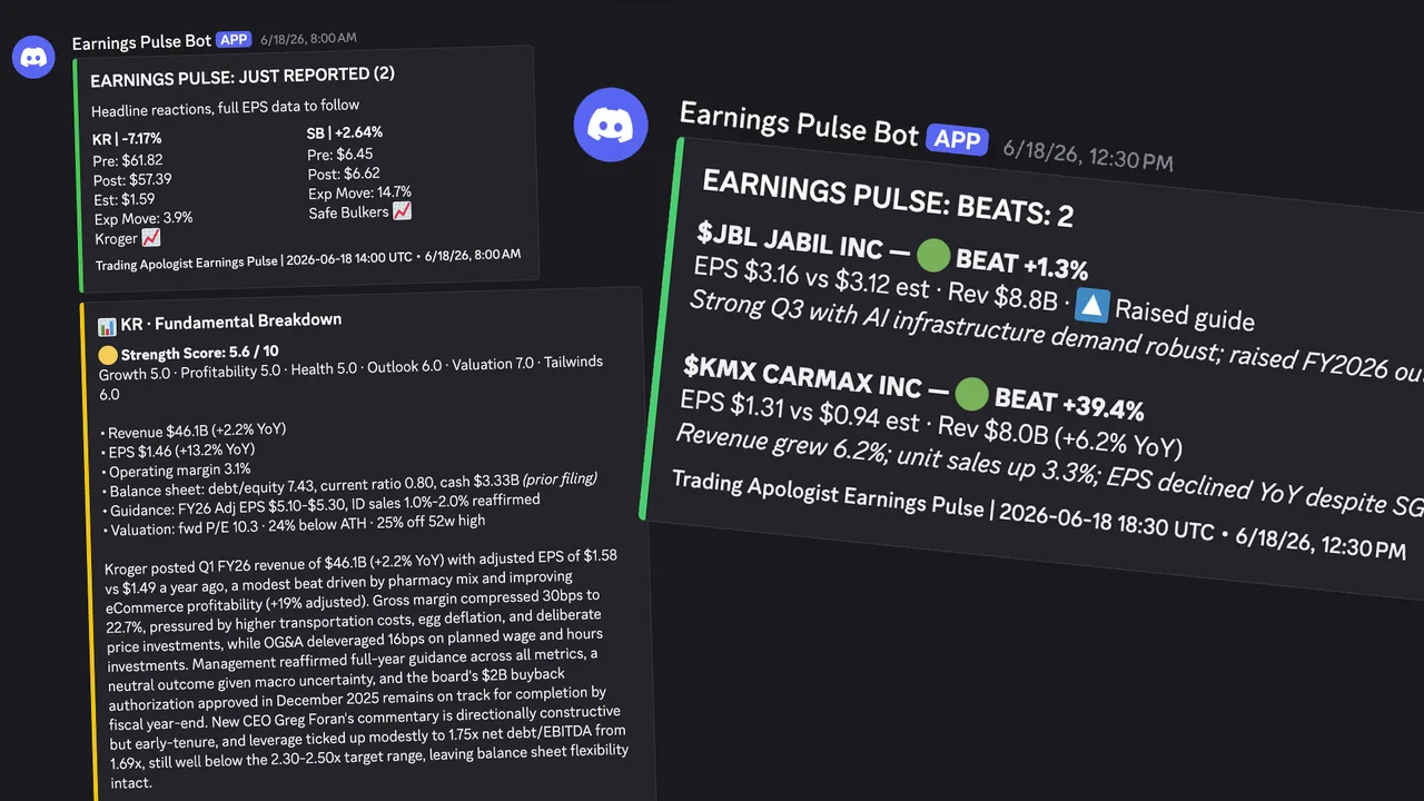
Channel: #earnings-pulse
What it does — Tracks a watchlist of ~315 tickers for earnings, in two modes: a weekly preview of the week ahead and a daily scan that catches results as they land with a two-tier alert system.
How to read it — Weekly Preview (Sundays): which watchlist names report next week, grouped by day, Before-Market-Open first then After-Market-Close, with EPS estimates where available. Headline Alert ("JUST REPORTED"): fires as soon as a company reports — even before EPS populates — showing the immediate reaction, pre/post price, consensus, and expected move. Full Results Alert: fires once actual EPS is in, showing beat/miss/met with the surprise percentage. The embed is green when more names beat than missed, red when more missed.
When it runs — Weekly preview Sundays at 4:00 PM ET; daily results every 30 minutes, 8:00 AM–11:00 PM ET, weekdays (the later hours catch after-close reporters).
Macro Monitor
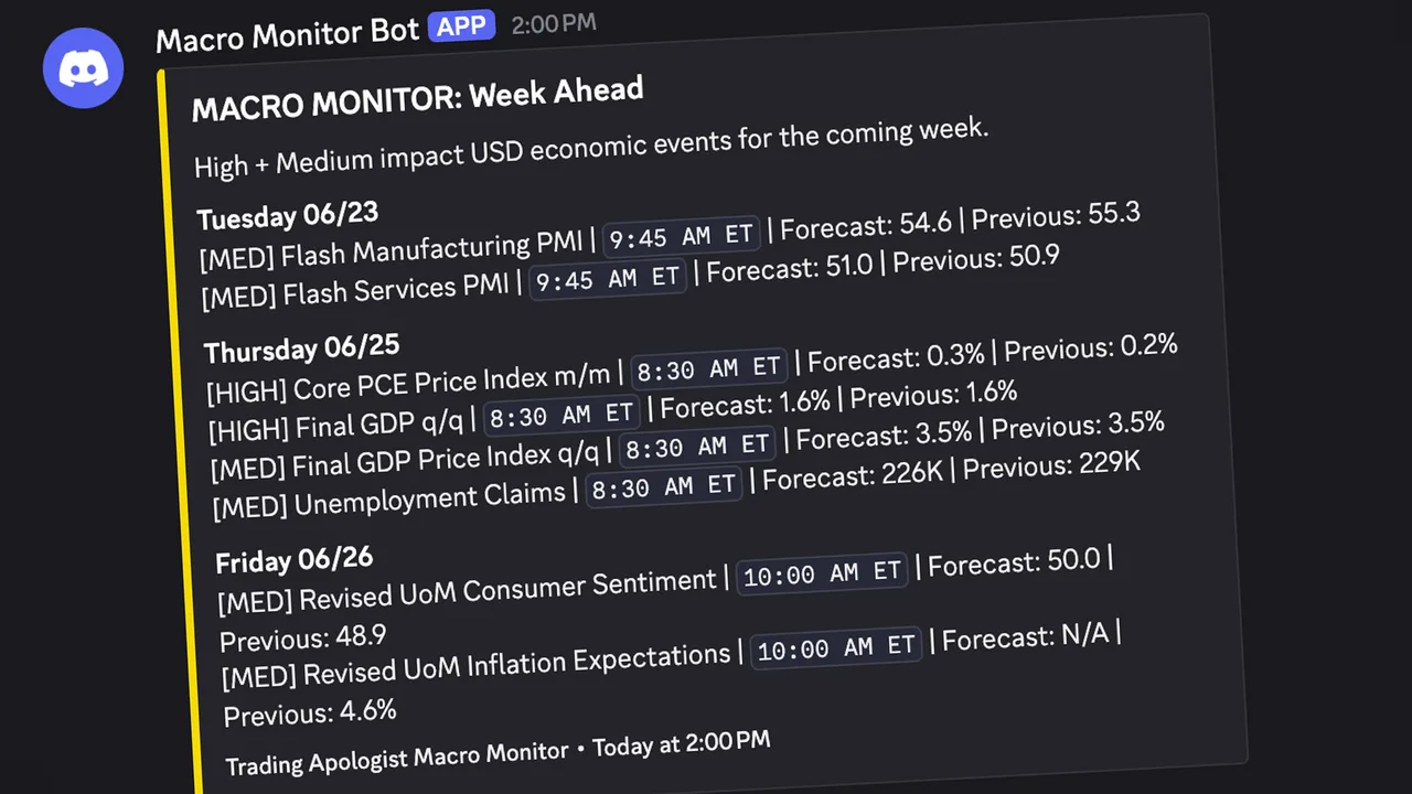
Channel: #macro-monitor
What it does — Tracks high- and medium-impact US economic events (CPI, PCE, GDP, Non-Farm Payrolls, jobless claims, retail sales, housing). It posts the week ahead with forecasts, then the real results as each release lands — with actuals pulled live from FRED, so you get the print against the forecast rather than just a "pending" note.
How to read it — Week Ahead (Sundays): all high/medium-impact USD events, grouped by day, with scheduled time, forecast, and previous reading. Upcoming Today: a morning heads-up of the day's events. Results: as each release hits, the event name, actual vs forecast, whether it came in above or below, and a colored circle for the quick read — green when the print is good for markets, red when bad, grey when in line. Direction is indicator-specific (cooler inflation reads green; rising jobless claims read red). A few proprietary prints (ISM PMI, Consumer Confidence) link to the Forex Factory calendar instead.
When it runs — Week ahead Sundays at 4:00 PM ET; daily every 30 minutes 8:00 AM–1:30 PM ET plus 2:00 and 4:00 PM, so results post within ~30 minutes of FRED publishing.
Market Vitals
The live equity-market health dashboard. It tracks the institutional internals that actually move regime — VIX and MOVE volatility, the McClellan Oscillator, market breadth (% of names above the 200-day), the put/call ratio, the Hindenburg Omen, and a smart-money flow index — and rolls them into a single constructive-to-defensive read, alongside the Cycle Peak Doom Clock. It is the always-on web version of the Market Vitals Discord screener.
Crypto Vitals
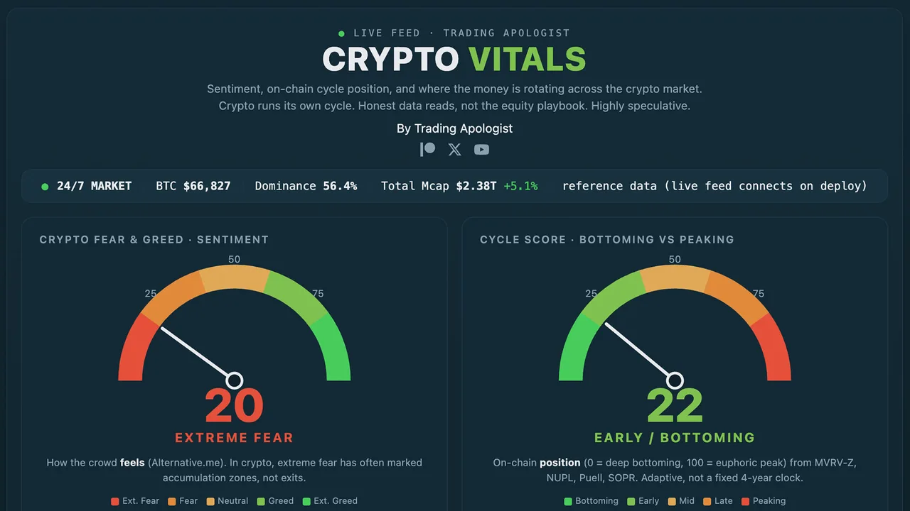
The live crypto-market health dashboard, the digital-asset companion to Market Vitals. It reads the internals that drive crypto regime — funding rates, BTC dominance, volatility, exchange flows, and breadth across the majors — and distills them into a single risk-on to risk-off read so you can gauge the tape at a glance.
SATS / SPCX Arbitrage
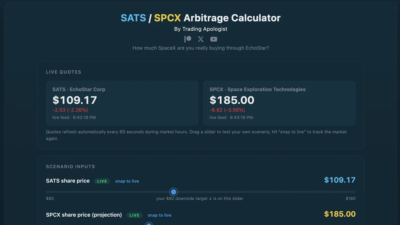
Live at: spcx-arb.tradingapologist.com
Overview
EchoStar (ticker SATS) sold spectrum to SpaceX and is owed a large block of SpaceX (SPCX) shares as payment. That makes every SATS share a partial claim on SpaceX. This tool shows you the effective price you are paying for SpaceX by buying it through EchoStar, versus buying SPCX directly.
Quick Start
- Open the page. The two live quotes (SATS and SPCX) drive everything.
- Read the big number: the effective price you pay per SpaceX share through SATS.
- Drag the SATS slider down to a downside target, or the SPCX slider up to project SpaceX higher, and watch the discount change.
- Hit snap to live on any slider to jump back to the current market price.
How It Works
The math comes straight from the filings:
- EchoStar is owed roughly 262 million SPCX shares, against about 290 million SATS shares outstanding.
- That works out to about 0.9 SpaceX shares behind every SATS share.
- Multiply 0.9 by the SpaceX price to get the SpaceX value behind one SATS share. Divide your SATS price by 0.9 to get the effective price you are really paying per SpaceX share.
Reading the Outputs
| Output | What it tells you |
|---|---|
| Effective price per SPCX via SATS (the big number) | What one SpaceX share costs you when bought through EchoStar. Lower than the market price = a discount. |
| SpaceX value per SATS share | The dollar value of SpaceX sitting behind one SATS share. |
| Discount / premium to SPCX | How much cheaper (or more expensive) the SATS route is versus buying SPCX outright. |
| Implied NAV per SATS share | The SpaceX stake plus whatever you assign to the rest of EchoStar. |
| Total stake value | The dollar value of all the SPCX shares EchoStar is owed. |
| Discount in dollars | The gap per SATS share, in dollars rather than percent. |
The Advanced panel lets you assign a value to EchoStar's non-SpaceX assets (Boost Mobile, DISH TV, Hughes, the AT&T cash, minus debt) and haircut the share count for the risks below.
Honest Risks
- EchoStar does not hold the SPCX shares yet. They deliver when the deal closes, targeted for late 2027 (SpaceX can accelerate). This is a waiting game.
- The shares arrive as restricted stock, not something you can flip immediately.
- EchoStar carries real near-term balance-sheet pressure (it deferred a large interest payment in June 2026 while waiting on cash from its AT&T spectrum sale).
- This is a discount with a waiting period and genuine risk, not a riskless arbitrage.
MSTR Bitcoin-per-Share
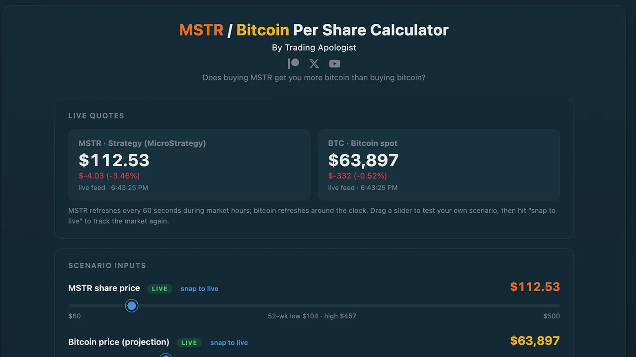
Live at: mstr-arb.tradingapologist.com
Overview
MicroStrategy (ticker MSTR, now branded Strategy) holds a huge amount of bitcoin. This tool answers one question: does buying MSTR get you more bitcoin exposure than just buying bitcoin? It shows the satoshis behind each share, the effective price you pay per coin, and whether the stock trades at a discount or premium to its bitcoin.
Quick Start
- Open the page. Live MSTR and bitcoin quotes drive the math (bitcoin updates 24/7).
- Read the headline: satoshis you own per MSTR share, and the verdict beneath it — whether buying MSTR gets you more or less bitcoin than spot.
- Use the Basic / Fully diluted toggle to switch share-count assumptions.
- Drag the dilution slider to model future share issuance, and the bitcoin slider to project the price.
How It Works
- MicroStrategy holds about 845,000 bitcoin against roughly 350 million shares, so each share carries about 241,000 satoshis (1 bitcoin = 100,000,000 sats). The bitcoin total auto-updates weekly from public filings.
- Multiply sats-per-share by the bitcoin price to get the bitcoin value behind a share. Compare that to where MSTR trades to get the premium or discount (the mNAV).
Reading the Outputs
| Output | What it tells you |
|---|---|
| Satoshis per MSTR share (headline) | How much bitcoin, in sats, sits behind one share. |
| Bitcoin per share | The same thing expressed in whole BTC. |
| Effective price per BTC via MSTR | What you effectively pay per bitcoin by buying it through MSTR. Below spot = a discount. |
| mNAV | Market price vs bitcoin value. Below 1.0 = discount, above 1.0 = premium. |
| $1,000 in MSTR vs $1,000 in BTC | A direct, dollar-for-dollar comparison of how many sats each gets you. |
| Shares to own 1 whole bitcoin | The "wholecoiner" number — how many MSTR shares equal one bitcoin of exposure. |
Basic vs Fully Diluted
- Basic (~350M shares) is the stock that exists and trades today.
- Fully diluted (~379M) adds shares that could exist if the convertible bonds convert, the STRK preferred converts, and options and units vest. It is the conservative, worst-case denominator. Sats-per-share is a bit lower on this basis.
How to Use the Dilution Slider
The slider adds shares while holding the bitcoin fixed, so it shows the pure dilution effect. Read it alongside the mNAV: when MSTR trades below 1.0 (a discount, like much of 2026), issuing stock to buy bitcoin genuinely dilutes existing holders, and the slider's warning is real. When MSTR trades at a premium, new issuance is actually accretive, and the slider overstates the damage.
Honest Risks
- The discount can disappear or flip — MSTR traded at a large premium for most of 2024 and 2025.
- Constant share issuance dilutes the bitcoin behind each share.
- In a long bear market, MicroStrategy could be forced to sell some bitcoin to cover debt and preferred dividends, which would shrink the bitcoin-per-share itself (it has already sold small amounts to fund a dividend).
TSLA / SPCX Merger Scenario
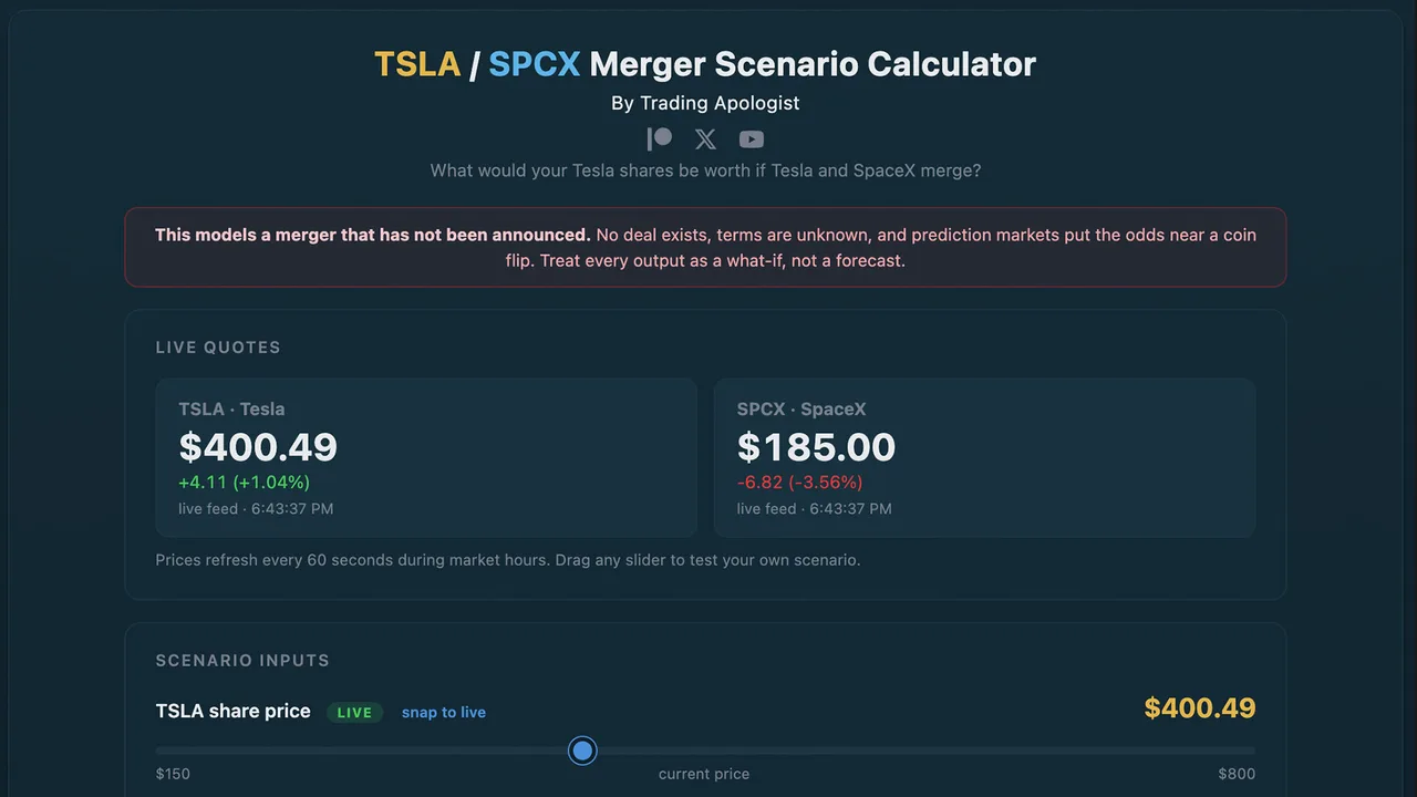
Live at: tsla-arb.tradingapologist.com
Overview
There has been heavy speculation about a Tesla / SpaceX merger. This tool models what your Tesla shares would be worth if such a merger happened. It is a scenario modeler, not an arbitrage calculator — no merger has been announced, Tesla owns almost none of SpaceX today, and the entire outcome depends on deal terms nobody has seen.
Quick Start
- Open the page (note the red banner — this is a what-if, not a forecast).
- Pick a merger-terms preset — these are anchored to real analyst positions.
- Read the headline: the implied TSLA price if the merger happens on those terms, and the upside or downside versus today.
- Optionally flip on Weight by merger odds to blend in the live probability.
How It Works
- The combined company is valued as Tesla's market cap plus SpaceX's market cap.
- The merger-terms slider sets what share of that combined company Tesla's existing holders end up owning. That single assumption drives everything.
- The implied TSLA price is that share of the combined value, spread across Tesla's shares.
The Presets
| Preset | TSLA holders' share | Source |
|---|---|---|
| Fair value | ~42% (computed live from market caps) | A no-premium split; lands at roughly today's price |
| Even split | 50% | Investor Alexandra Merz's thesis |
| Tesla-favored | 66% | Morningstar (views SpaceX as overvalued) |
| Bear case | ~30% | Gary Black's warning that a bad deal hurts Tesla holders |
The lesson: at "fair value" you are roughly flat. Every point above that is value Tesla holders would have to win at the negotiating table — and they have no voting control to force it.
The Merger-Odds Toggle
Turn it on and the tool pulls the live Kalshi prediction-market probability of a merger (around 54% for a deal by May 2027 as of mid-June 2026) and blends the two outcomes into an expected value: (odds x merger price) + (no-merger chance x today's price). A small chart builds a history of the odds over time. You can also override the probability manually.
Honest Risks
- The merger may simply never happen — prediction markets put it near a coin flip.
- Tesla shareholders do not control Tesla, so a deal could be struck on terms that favor the SpaceX side, which Musk fully controls.
- This is the most speculative tool in the suite. Treat every output as a thought experiment.
Bitcoin Treasury Tracker
Live NAV, mNAV, and bitcoin-per-share for the largest publicly-traded Bitcoin treasury companies, from Strategy (MSTR) down. Holdings come from each company’s own filings and disclosures, valued against the live BTC price, so you can see which names trade at a discount or premium to the bitcoin they hold.
SOL Treasury Tracker
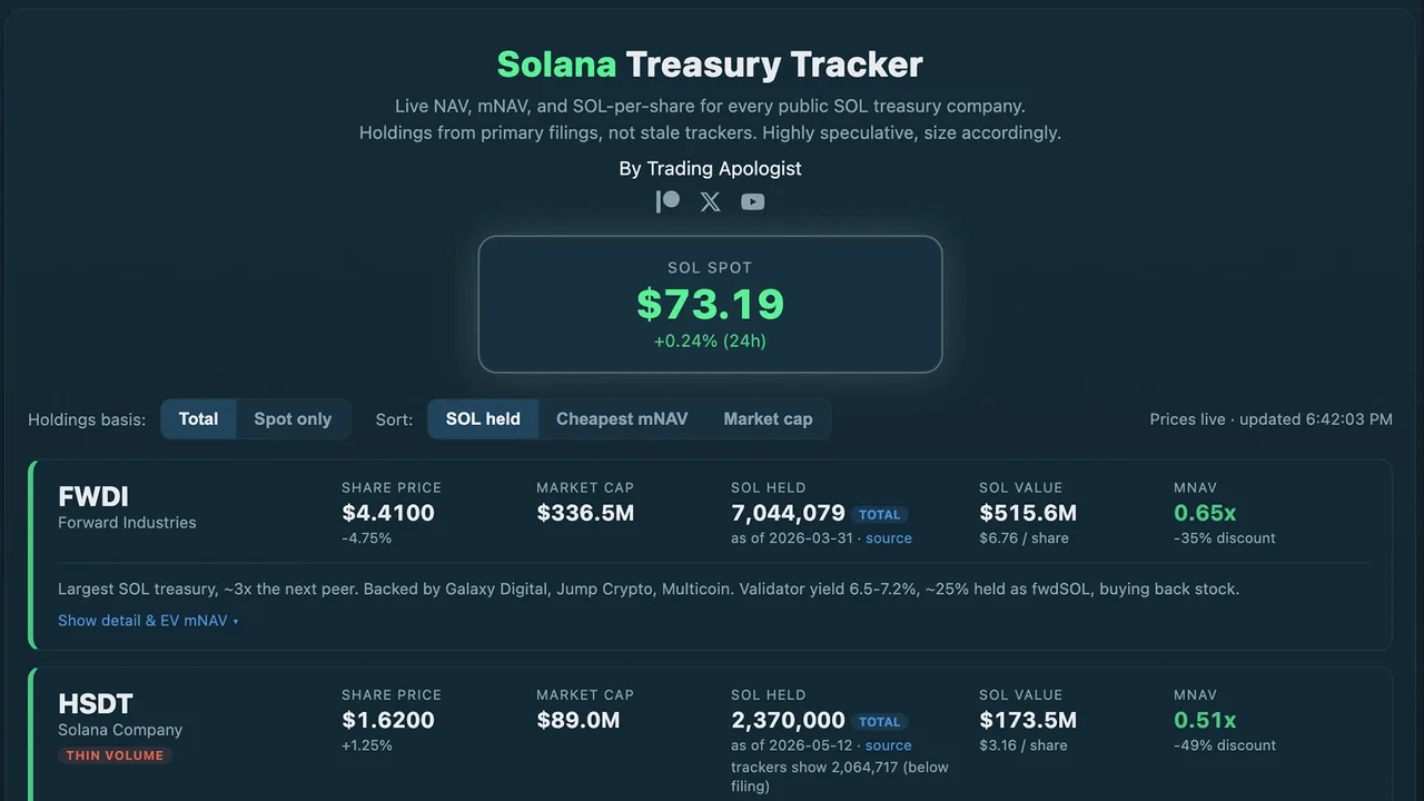
Live at: sol-treasuries.tradingapologist.com
Overview
A live screener of every public Solana (SOL) treasury company side by side, with NAV, mNAV, premium/discount, and SOL-per-share recomputed on live prices. Its edge over the trackers floating around: holdings come from each company's own filings with a date and a source, not from stale third-party counts, and it shows you where those trackers disagree with the filings.
Quick Start
- Open the page. The big SOL spot box at the top drives the SOL side; each card pulls its stock's live price.
- Each company is a card. Read the mNAV on the right — green is a discount (trading below its SOL), amber is a premium.
- Use the controls to sort (SOL held / cheapest mNAV / market cap) and switch the holdings basis (total vs liquid-only).
- Click Show detail & EV mNAV on any card for the enterprise-value view and the full breakdown.
Reading a Card
| Field | What it tells you |
|---|---|
| Share price | The stock's live price and daily change. |
| Market cap | Share price times shares outstanding (live). |
| SOL held | The treasury, from the latest filing, with an as-of date, a source link, and a basis badge (total or spot). |
| trackers show ... | Where a third-party tracker disagrees with the filing — the accuracy check. |
| SOL value | The market value of that SOL, and the dollar value of SOL per share. |
| mNAV | Market cap vs SOL value. Below 1.0 = discount (green), above = premium (amber). |
The Most Important Feature: Basic vs EV mNAV
The headline mNAV on each card is the basic version (market cap vs SOL value). Open the detail for the enterprise-value (EV) mNAV, which adds the company's debt and subtracts its cash. This often flips the picture entirely:
- A name can look like the deepest discount on basic mNAV but be trading at a premium once you account for a mountain of convertible debt. The basic number flatters debt-heavy companies; the EV number is the honest one.
- Companies with no debt are the genuine discounts — their basic and EV numbers stay close.
Always check the EV mNAV before concluding a name is "cheap."
Other Controls
- Holdings basis (Total / Spot only): total includes locked and staked SOL; spot shows only the liquid, unlocked portion where a company discloses it.
- Delegated SOL (one company, STKE) is shown separately and is never counted as owned — it is client money under delegation, not treasury.
- Thin-volume flags mark the names that are especially small and illiquid.
The Companies Tracked
Six as of mid-June 2026: FWDI (Forward Industries, the largest), DFDV (DeFi Development Corp), UPXI (Upexi), HSDT (Solana Company), SKYA (SkyAI, formerly Sharps Technology), and STKE (Sol Strategies, an operator that trades at a premium). More are added as they qualify.
Honest Risks
- These are all small and micro-cap, thinly traded, and highly speculative.
- A NAV discount is not a guarantee of anything — these stocks can trade below the value of their crypto for long stretches.
- Some holdings carry locked or restricted portions, and at least one company has sold SOL to settle debt. Read each card's detail.
Trading Education
Courses & Lessons
In-depth education on Patreon. Active members get the full videos; everyone can preview what's covered.
Trading Resources
Guides & Downloads
Reference material and downloads. Hosted on Patreon, so access stays with active members.
Web Tools